Picture of Wallpaper

Wallpaper

The official Pinterest account of Wallpaper* magazine. Here, we share our top global finds from the spheres of architecture, design, interiors, fashion and art.

Hannah Murray’s paintings seduce and unsettle in equal measure

Hannah Murray’s paintings seduce and unsettle in equal measure

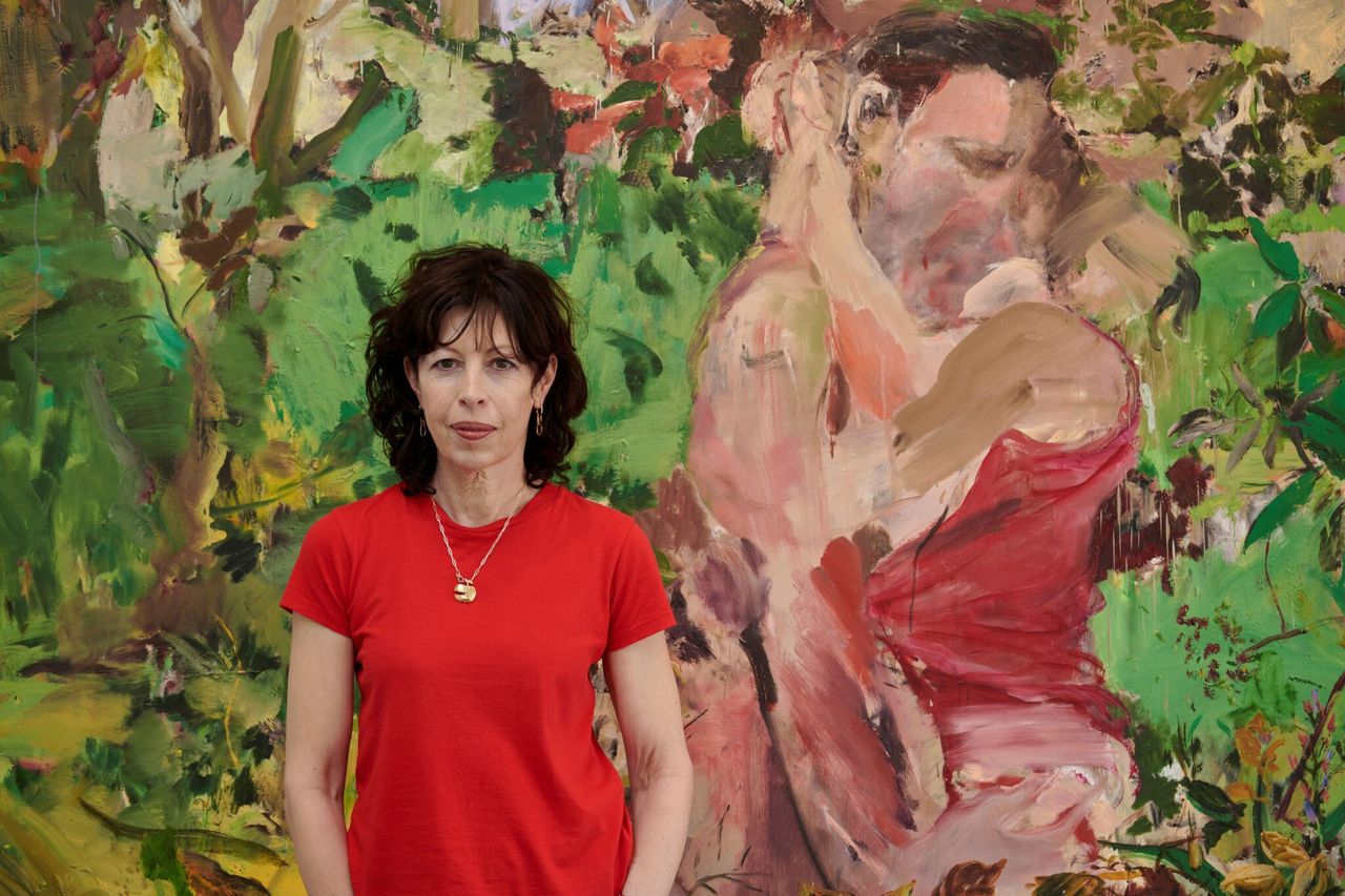
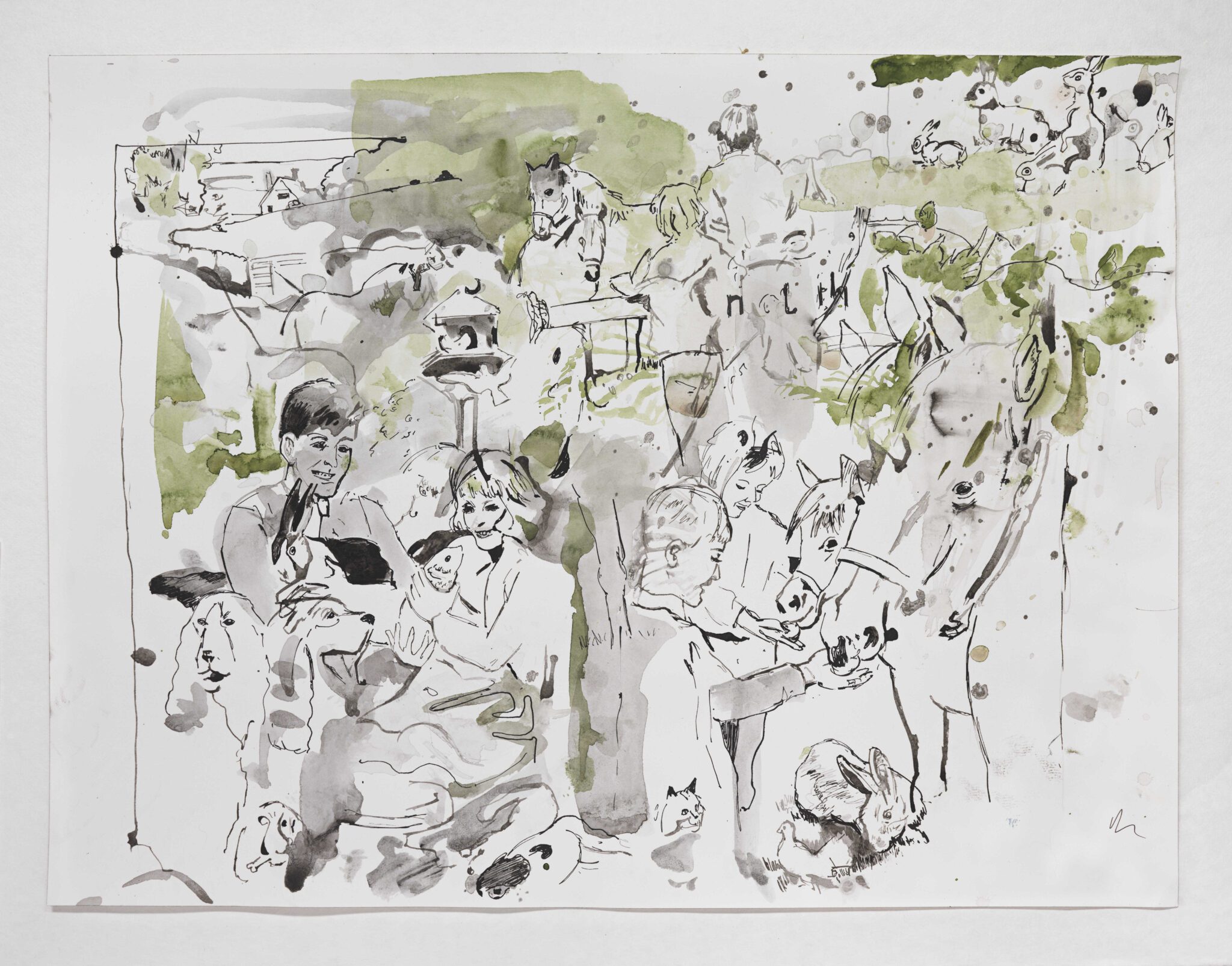
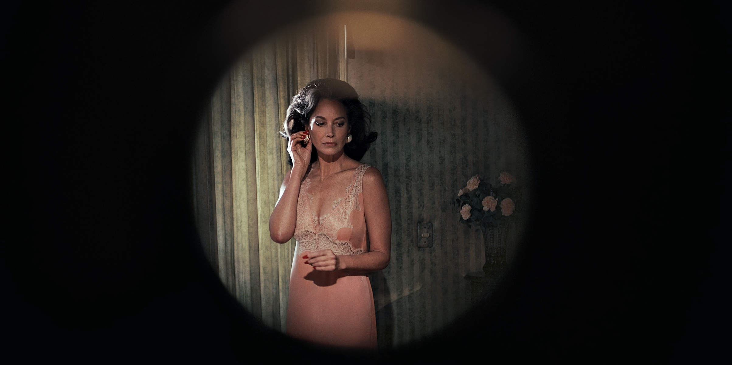
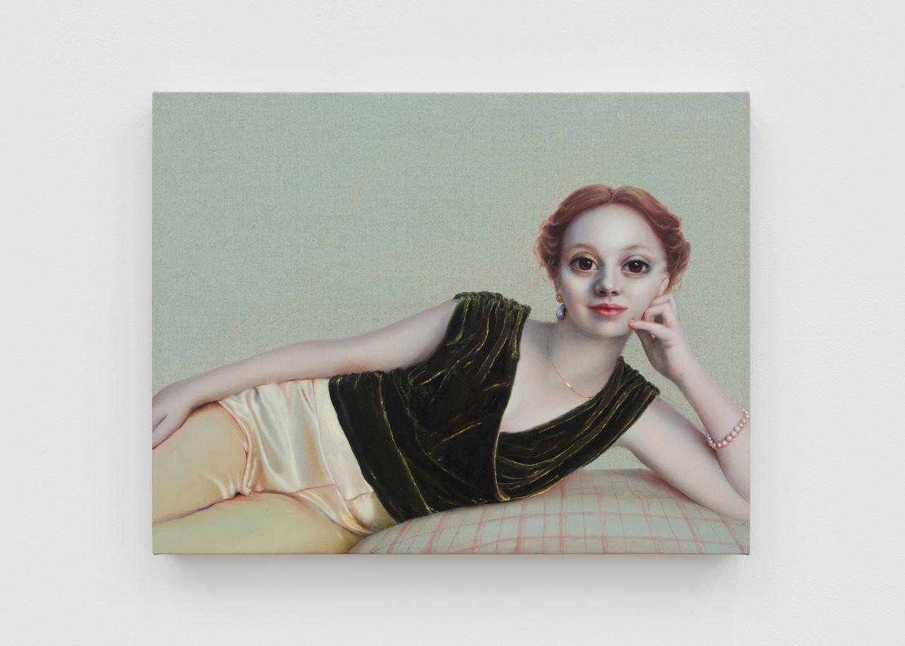
There is something uncanny, and seductive, in Hannah Murray’s work. The figures in her paintings are almost familiar to us – we may recognise the house in which they sit, the folds of their velvet jacket, or a baby balancing on a hip, but the faces give us pause. Murray’s works are populated with figures whose proportions are more than a little off.

‘It is quite a natural thing for me to do,’ says Murray when we speak over Zoom to mark the opening of her current exhibition at Ginny on Frederick in London. ‘I am interested in the idealisation of women, and the way that women have been painted. I’m leaning into it and examining why images like this can stir up anxiety and discomfort in people. In the world that we live in, women are starting to take on these kinds of qualities, with bigger eyes and atmospheric skin. By giving so much detail to some elements, and then drawing back on the texture on skin, it does add a surreal feeling.’

Hannah Murray painting of woman with big eyes and baby on hip

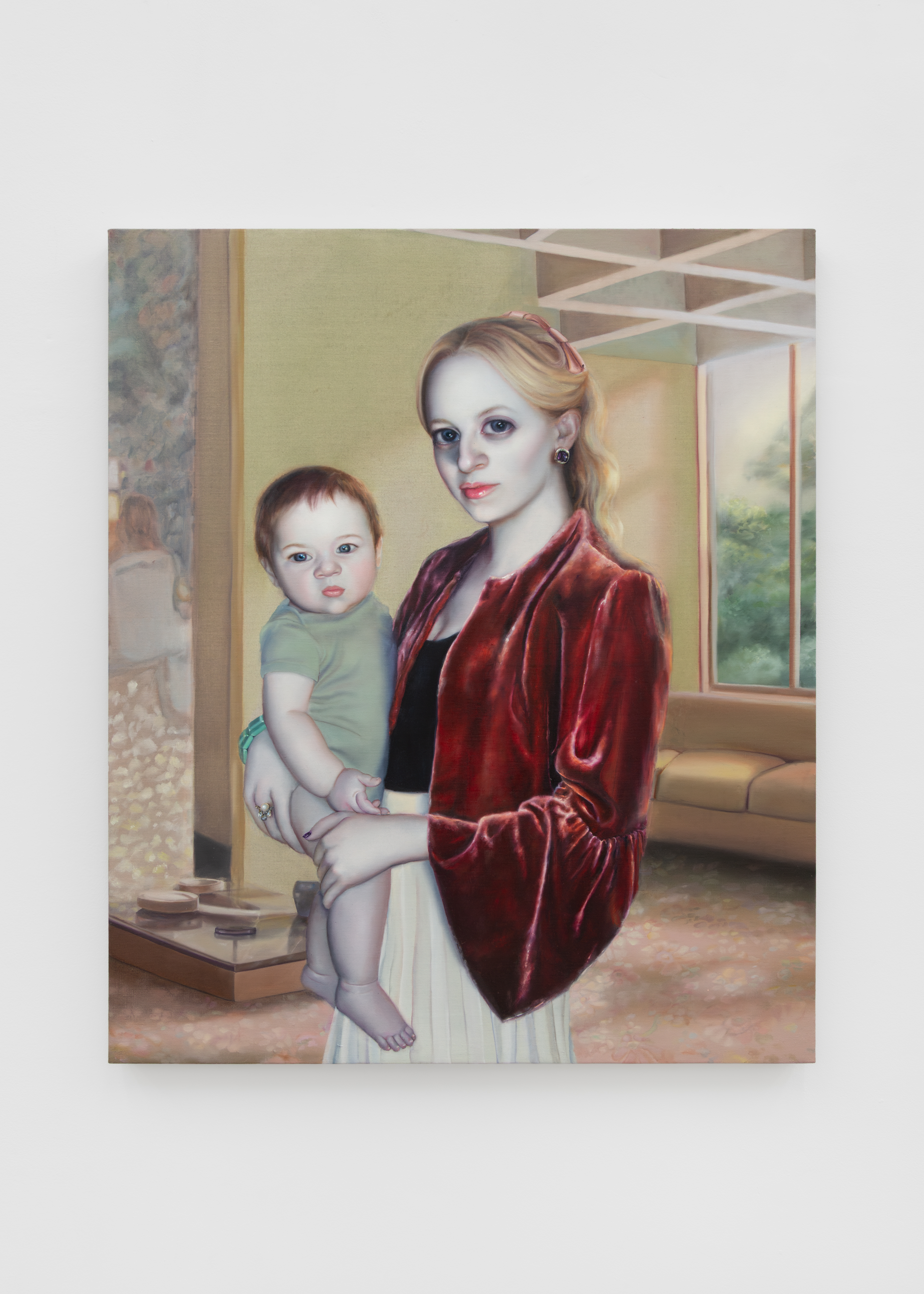
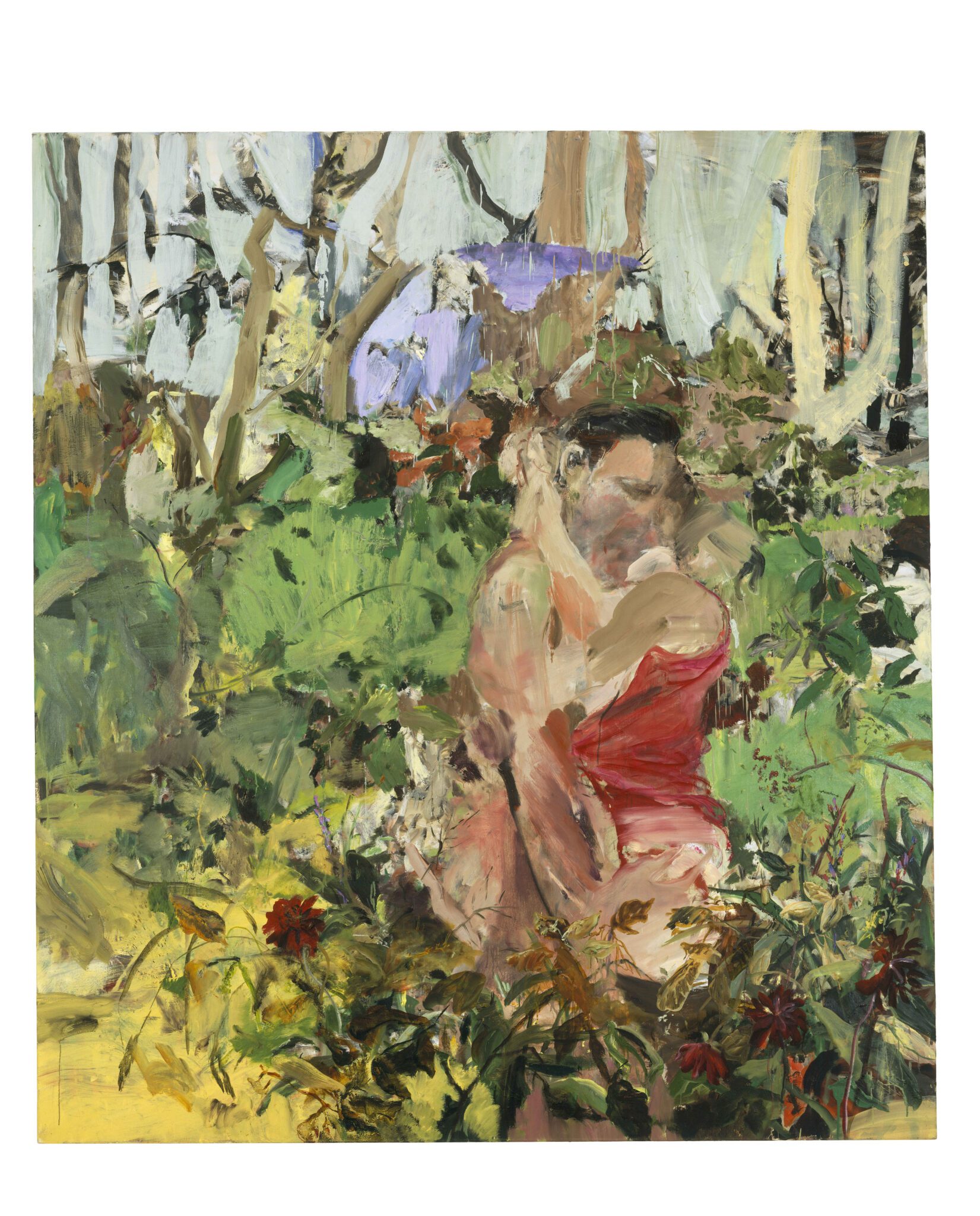
Hannah Murray, Henry & Me, 2026

(Image credit: Photography by Corey Bartle-Sanderson)

London-born Murray, who studied at the New York Academy of Art, works from photographs of friends, but the portraits take on their own, subversive life beyond the limits of direct representation. ‘In the paintings, friends become unrecognisable. I don’t know if it’s subconscious that the eyes get bigger, but eyes have always been the most important part of a portrait for me. They hold so much emotion and feeling. A lot of the time, the women in my paintings are surrounded by so many micro decisions that they’ve made – nail colour, the outfit – they’re usually quite distant. I’m interested in what’s going on behind that surface level.’

Hannah Murray painting of woman with big eyes

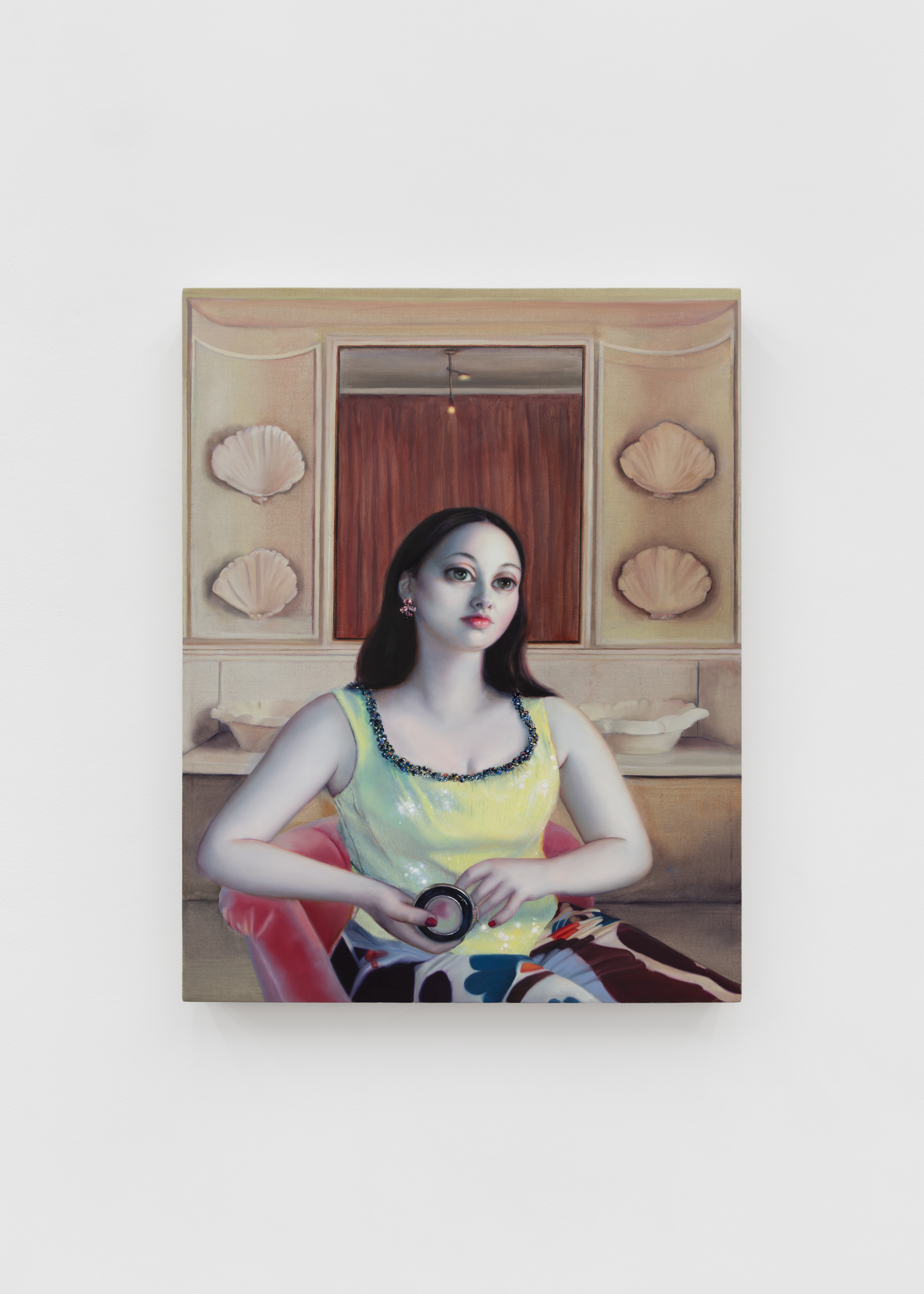
Hannah Murray, Angelina, 2026

(Image credit: Photography by Corey Bartle-Sanderson)

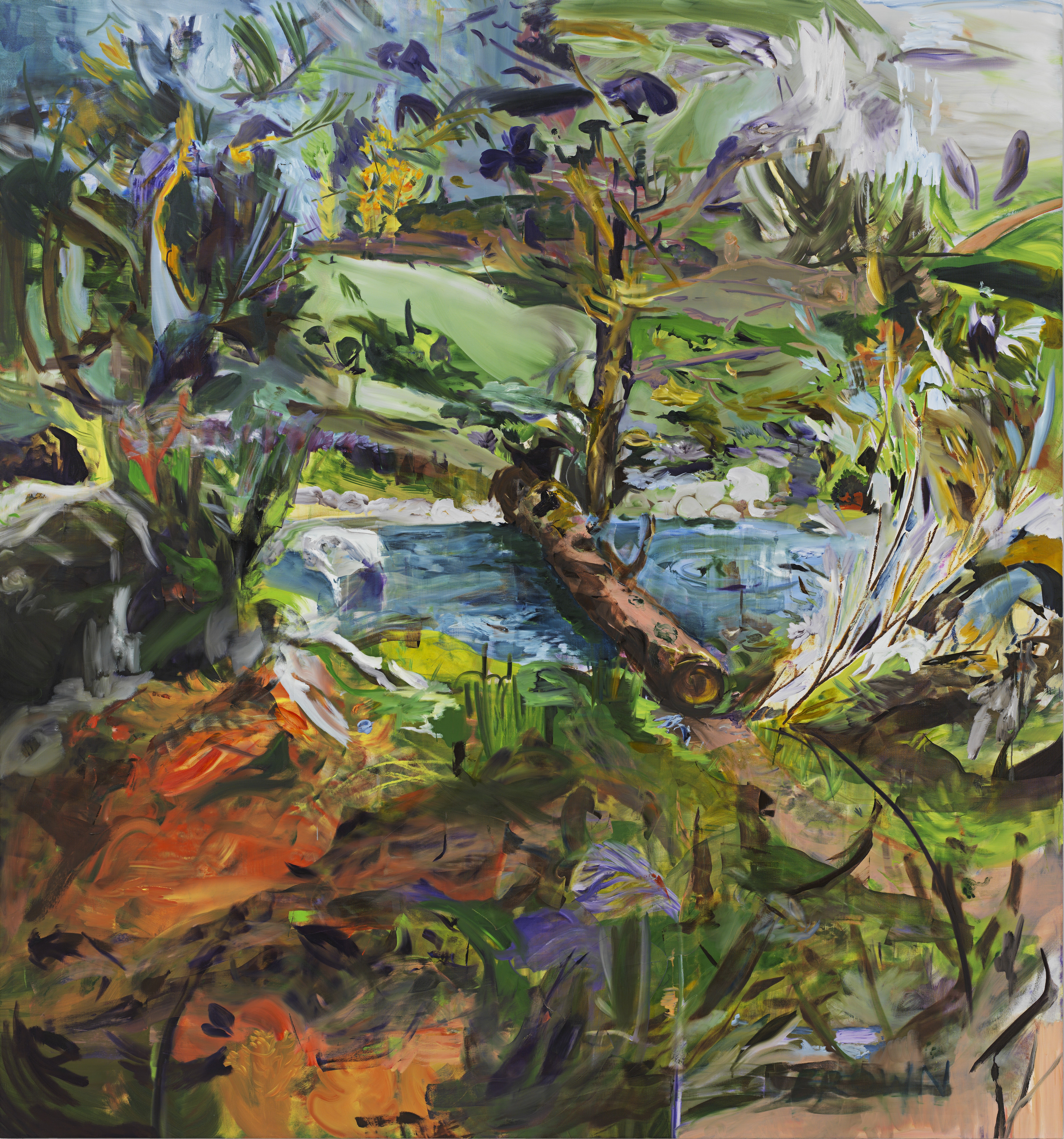
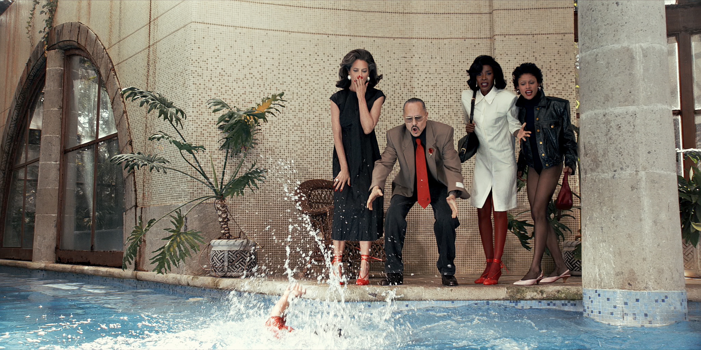
Murray’s interiors recall the rich domestic worlds of the Dutch golden age of painting, with colours and patterns brought to sumptuous life in rich oils. ‘I’m trying to do things that I relate to, and I’m in my thirties now – interiors are part of my world. It’s fun to kind of play with them, and make a set where the women become characters. Each painting has such a different atmosphere.’

Hannah Murray painting of woman with big eyes

Hannah Murray, Show Girl, 2026

(Image credit: Photography by Corey Bartle-Sanderson)

She finds inspiration everywhere. ‘I’m constantly taking photos. I love looking at Italian villas, homes in the UK, Pinterest. I never plan where the figure will be in advance.’

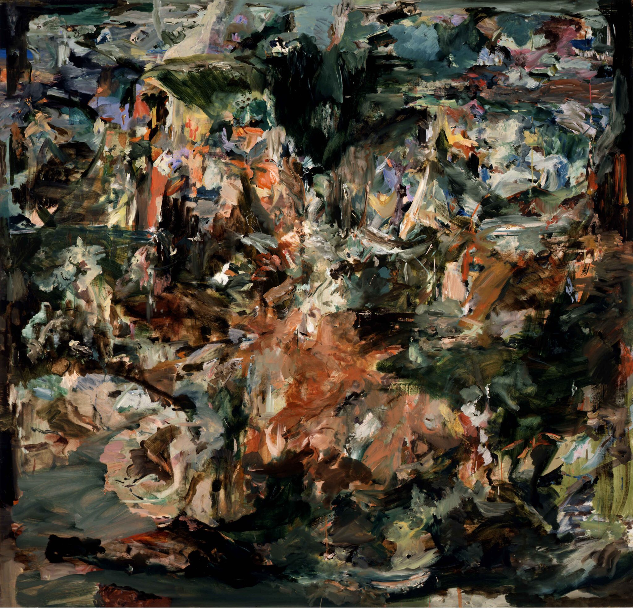
A sense of hyperreality throughout lends a feeling of unease to immaculate homes in Murray’s works. Fractured light, playing on unpredictable and blurred surfaces, creates dreamy or nightmarish backgrounds for the exaggerated femininity of the figures. ‘I want it to be subtle. I’m not interested in irony for its own sake. I want the softness and the beauty to feel honest, still. It’s a perfectionism that’s not quite attainable – it adds to that unsettling feeling.’

Hannah Murray, ‘Charm’, at Ginny on Frederick until 10 April 2026

Receive our daily digest of inspiration, escapism and design stories from around the world direct to your inbox.

ginnyonfrederick.com

Hannah Murray painting of a couple on balcony

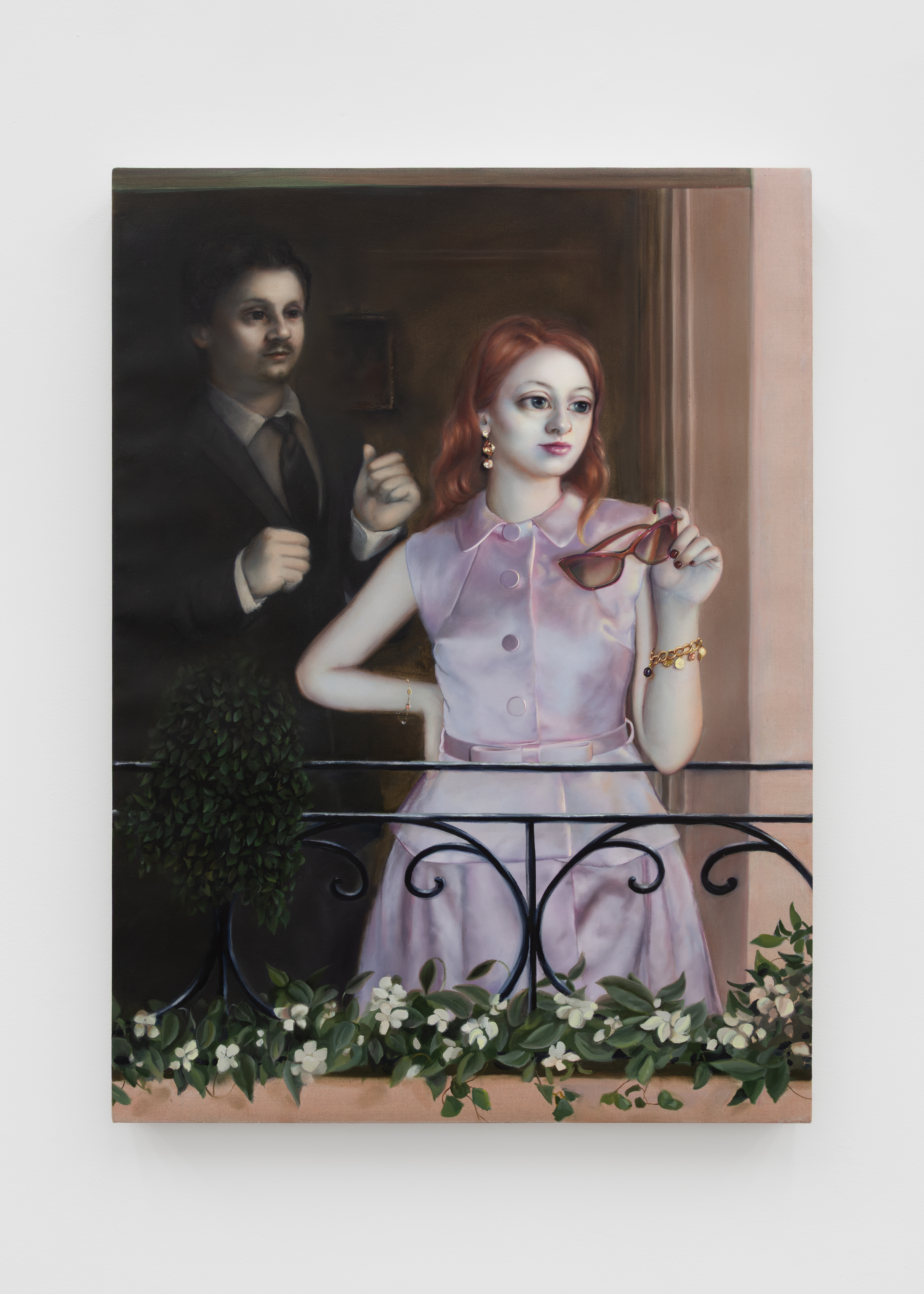
Hannah Murray, Balconette, 2026

(Image credit: Photography by Corey Bartle-Sanderson)

Hannah Murray painting of a woman putting on earrings

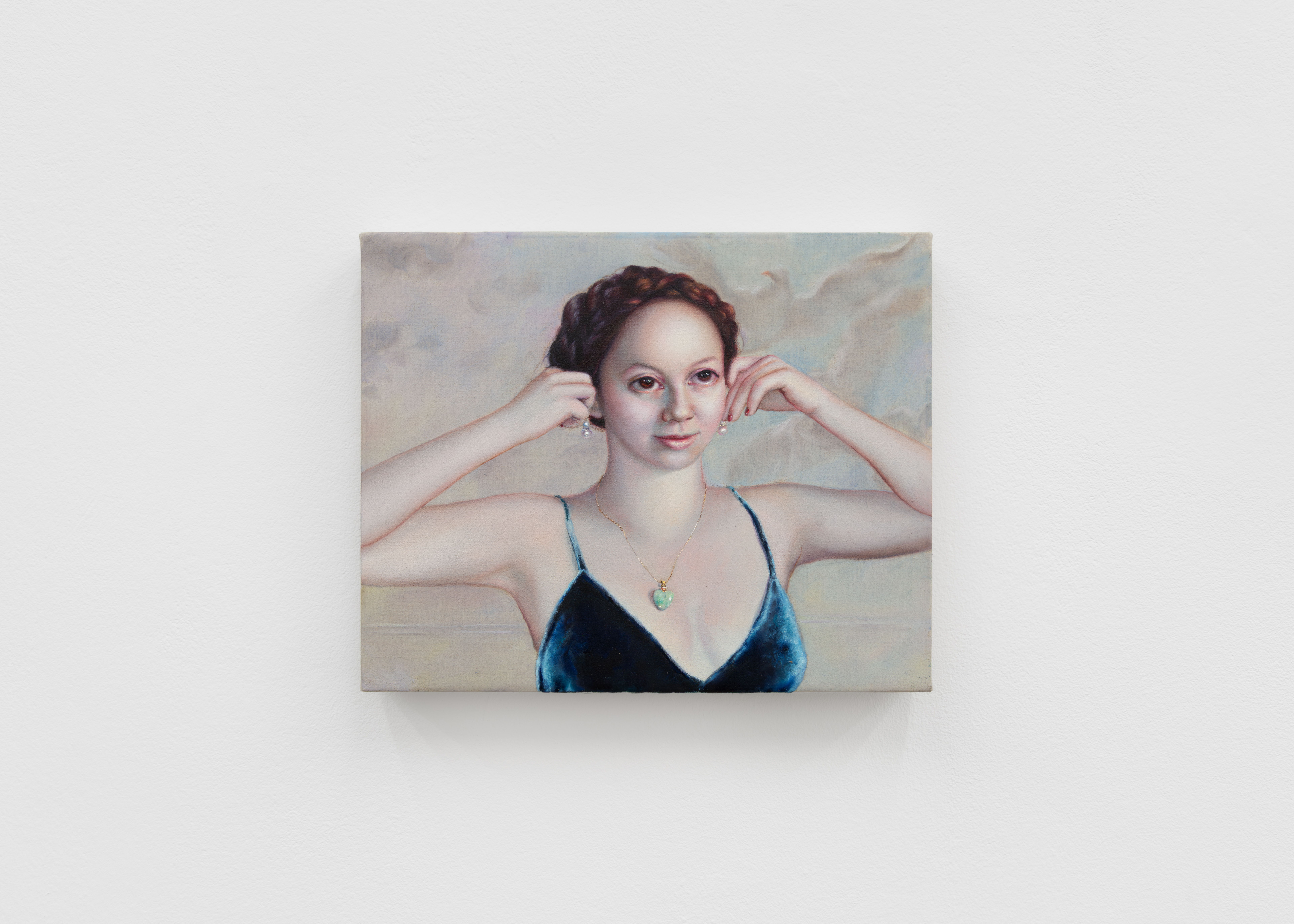
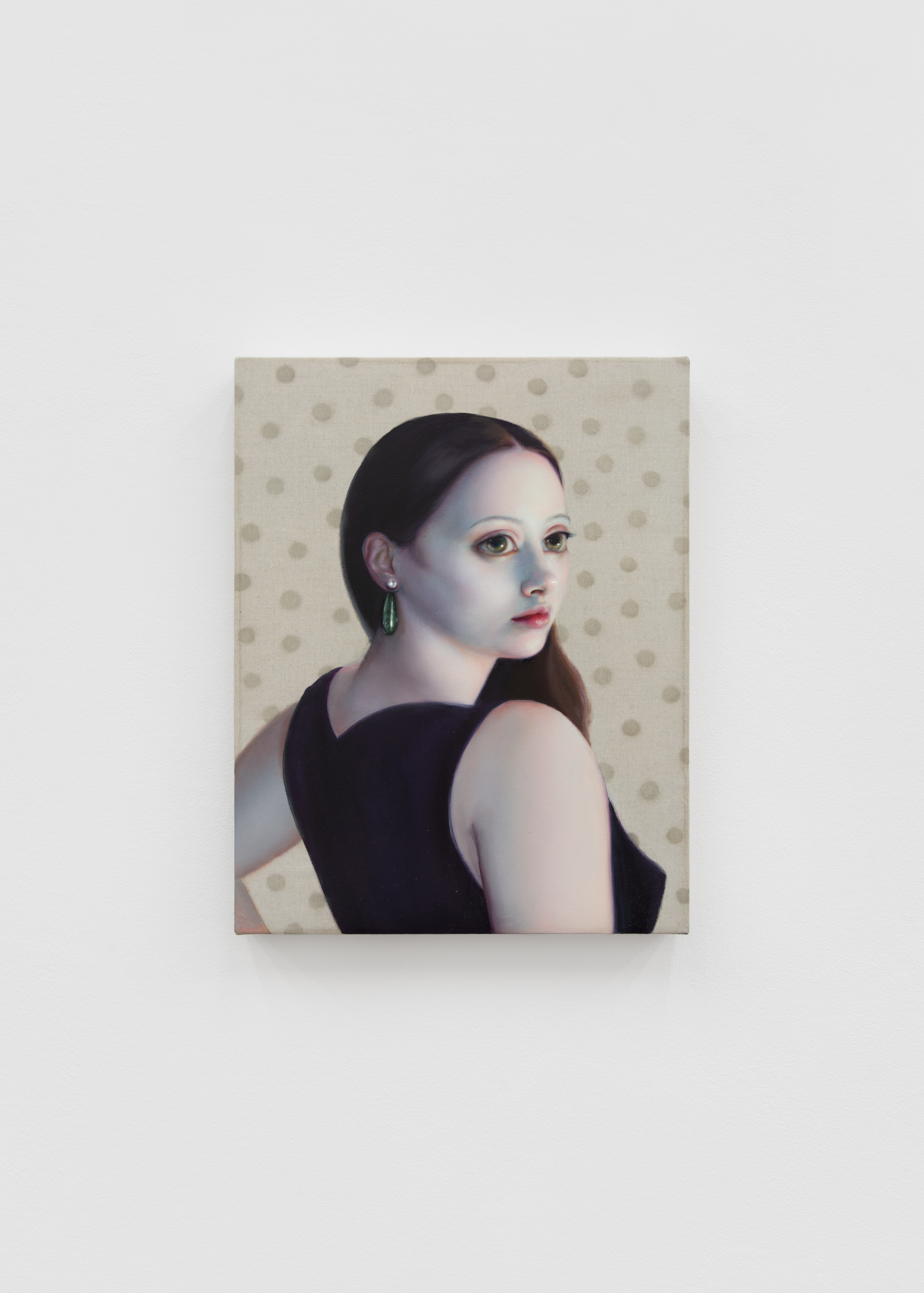
Hannah Murray, Forever Jade, 2026

(Image credit: Photography by Corey Bartle-Sanderson)

This spiral-shaped Spanish library houses over 5000 rare fashion books

This spiral-shaped Spanish library houses over 5000 rare fashion books

The port city of A Coruña on Spain’s Galician coast has become an unexpected destination for fashion and photography enthusiasts since the opening of the Marta Ortega Pérez (MOP) Foundation in 2022 (Ortega Pérez is the non-executive chair of Inditex, the parent company of Zara, which is based in the nearby Arteixo). It has hosted a slew of impressive exhibitions in its first few years, often bringing the work of a photographic great to Spain for the first time – such was the case for an Irving Penn retrospective, so too for David Bailey in ‘Changing Fashion’, and most recently Annie Leibovitz, whose career-spanning show is open until May.

This month, the foundation opened its fashion and photography library, an evolving collection of over 5,500 titles that are free to explore on-site. In the works for the past two years, the library is a natural extension of the MOP Centre’s broader cultural programme that aims to ‘to build a community that can engage with photography beyond the exhibition itself,’ explains Leticia Castromil, Director of the MOP Foundation. ‘Within that context, we have gradually built a body of references that reflect both the programme and the wider field we are part of. The library was conceived as a way to give that material its own space: not just to preserve it, but to make it accessible as part of a more integrated and continuous experience.’

The MOP Library in A Coruña, Spain

MOP Foundation A Coruna Fashion Library Zara

(Image credit: Yago Castromi)

Housed on shelves that gradually spiral upwards – ‘the intention was to create a space that feels both intimate and monumental’ says Castromil – the vast collection spans books, magazines and catalogues from the late 20th century to the present day. It will grow significantly each year, by more than 200 titles. ‘Photography, fashion, and visual culture are disciplines that are deeply connected to the present,’ explains Castromil. ‘It is about building a living collection, not a static one.’

‘There are many special pieces within the collection, particularly rare fashion publications and out-of-print photography books that are not easily accessible through public libraries,’ she continues. Titles include photography books by Nan Goldin, Diane Arbus and Tim Walker; tomes on the influential illustration of Antonio Lopez or Milton Glaser’s graphic design; works dedicated to filmmakers like Larry Clark and John Waters; historic Comme des Garçons catalogues; and complete runs of magazines. ‘Early issues of magazines such as Vogue Italia under Franca Sozzani, Self Service, or Interview are especially meaningful – not only for their editorial quality but for the way they capture very specific cultural moments,’ Castromil says.

MOP Foundation A Coruna Fashion Library Zara

(Image credit: MOP Foundation)

Crucially, they are all free to discover – in-person only, which feels like a rarity in an increasingly digital-first world. ‘We see the library as a space for discovery and reflection. It is not conceived as a traditional reading room, but as an environment where visitors can engage with visual culture in a more intuitive and personal way,’ says Castromil. ‘Ultimately, we hope visitors will find in it a sense of curiosity and inspiration.’

You can book an appointment via the MOP Foundation website.

MOP Center, Muelle de Batería, Avenida de Jardines de Méndez Núñez s/n – 15003 – A Coruña, Galicia.

Receive our daily digest of inspiration, escapism and design stories from around the world direct to your inbox.

Tour a collector’s Las Vegas house, ‘a quiet frame for art’

Tour a collector’s Las Vegas house, ‘a quiet frame for art’

A stone’s throw from the bustle and bling of the Las Vegas Strip, a sleek but understated building rises from the desert – a structure that, while elegant, the casual observer would not likely guess contains a remarkable private art collection. Once inside, you’re left to wonder, is this an art gallery or a private home? In short, it’s both. It’s actually the home of Todd-Avery Lenahan, president and COO of Wynn Design and Development, the in-house creative studio for gaming and hospitality corporation Wynn Resorts, and his husband John Gorsuch. The collection is so varied that pieces from antiquity coexist with unapologetically contemporary objects. It is not uncommon, for instance, to see, on the same wall, an abstract painting by Joan Miró and an oil portrait by Thomas Phillips.

interior of a packed living room full of artwork and design objects, in a lush Las Vegas house

In a reception room, club chairs by Quatrain for Dessin Fournir sit around Lucite coffee tables from Allan Knight, on which sit Grand Tour cork models by Dieter Cöllen, including several after those in the Sir John Soane museum, for whom Cöllen carried out restoration work. On the floor is a silk rug by Patterson Flynn. Above the fireplace hangs La Memoire by Theodoor Verschaeren, while in front of it is a copper and gilt bronze candelabra by Claude Lalanne. On the easel is a French School painting, traditionally identified as The Sleeping Hector

(Image credit: Douglas Friedman)

Tour this art-rich Las Vegas house

This is not to imply incoherence. Lenahan strives to achieve a balance; the diverse art in his home is curated as if the works are in conversation. ‘I joke with my husband all the time. It’s time to let them start their party when we turn out the lights at night. I feel like these [works] are all having a dialogue with one another. It’s fun for me to imagine that,’ he says. ‘I look for pieces that define how an artist at a certain point in time was capturing what they considered the ultimate expression of either male or female beauty.’

interiors of an art filled Las Vegas house

The Sacrifice of Isaac, by Alessandro Gherardini, sits on a gilded wallcovering by Fromental, alongside a gilt textile work by Olga de Amaral

(Image credit: Douglas Friedman)

interiors of an art filled Las Vegas house

On the Empire-style demilune games table is Le Métaphore (Canard-Bateau) by François-Xavier Lalanne, while on the wall behind are paintings by Anthonie de Lorme and Augustus Wall Callcott

(Image credit: Douglas Friedman)

The home’s design intentionally enables this interplay of mediums, periods and themes. The architect, the Las Vegas-based Daniel Joseph Chenin, describes the dwelling as ‘a quiet frame for art’ and ‘a study in discipline and clarity… that resists the desert’s appetite for spectacle and instead unfolds as a sequence of intimate, curated spaces’. Those spaces seem to perfectly facilitate the amalgam of heritage and modernity, with Chenin’s architectural rigour and cinematic approach aligning seamlessly with Lenahan’s mastery of atmosphere, hospitality and storytelling.

‘I look for pieces that define how an artist at a certain point in time was capturing what they considered the ultimate expression of either male or female beauty’

Todd-Avery Lenahan

interiors of an art filled Las Vegas house

In the hallway to the bedroom, Second Girl Sitting on Bench, by Lynn Chadwick, is perched between Allegory of the Arts by Jan van der Straet and Steven Meisel’s Untitled II, from Four Days in LA: The Versace Pictures, which was once owned by Elton John

(Image credit: Douglas Friedman)

interiors of an art filled Las Vegas house

Auguste Rodin’s Vase of the Titans, created for sculptor Albert-Ernest Carrier-Belleuse, sits on a Biedermeier table from New York antiques gallery Iliad, while in the background is a Roman Empire marble bust. The space is lit by a bronze and rock crystal chandelier by Christopher Boots and The Urban Electric Co wall sconces

(Image credit: Douglas Friedman)

At the main entrance, you are greeted by Auguste Rodin’s Vase of the Titans, an early piece that the artist created while working with French sculptor Albert-Ernest Carrier-Belleuse. This was one of Rodin’s first human figures moulded by hand and then cast in terracotta. Looking closely at the cast, one can still see his fingerprints. Nearby stands Antoine Bourdelle’s Penelope Waiting, which Lenahan had coveted for more than two decades after seeing it in a black-and-white photograph (a version of the sculpture is on display at Musée Bourdelle in Paris).

interiors of an art filled Las Vegas house

The house is designed by Las Vegas-based architect Daniel Joseph Chenin

(Image credit: Douglas Friedman)

las vegas house

(Image credit: Douglas Friedman)

During a meeting at the Sladmore Gallery in London, Lenahan mentioned his longstanding admiration for the piece, only to discover the owner Edward Horswell had one of the few existing casts. ‘He said, “Todd, I’ve never heard anyone get so excited about something that was deeply meaningful to them, that they’ve been dreaming about for decades,” and he made it available to me,’ Lenahan recalls.

art over console in las vegas house

(Image credit: Douglas Friedman)

las vegas house

(Image credit: Douglas Friedman)

His collection includes bronze sculptures by Colombian artist Fernando Botero, which answer to British artist Lynn Chadwick’s geometric abstractions nearby. The varied aesthetic that Lenahan has created is a little hard to categorise, existing somewhere between Sir John Soane’s layered historicism and the sophisticated eclecticism of fashion legend Bill Blass. The distinguishing factor is Lenahan’s approach and the way he views himself not as an owner but as a custodian. ‘I don’t really see them as mine,’ he says. ‘I see them as belonging to the world. These things are so old, they’ve been in the hands of so many people before me. And I am now just one of the many people in these works’ lives responsible for their care.’

interiors of an art filled Las Vegas house

Either side of the doorway to the kitchen hang Three Figures by Robert Motherwell and Portrait of a Gentleman by Artemisia Gentileschi. To the right is a cork model by Cornelius Daniel Ward on a Grand Tour table by David Prot; to the left is a cast bronze chair by Andrea Salvetti for Dilmos; and on the floor is a 19th-century Sultanabad rug. In the kitchen is a Warren Platner table with a pair of Klismos chairs from Jonathan Sainsbury

(Image credit: Douglas Friedman)

His philosophy extends beyond the preservation of these works, which have also had to have extensive physical conservation to prevent their deterioration over time; he believes in actively facilitating the cultural conversation. When museums request loans, as they have for his Portrait of a Gentleman by Artemisia Gentileschi, which was recently loaned to Paris’ Musée Jacquemart-André, and a fibre work by Olga de Amaral that appeared last year at the Fondation Cartier, Lenahan never asks for payment. ‘My pieces are loaned from my heart with total trust that they’re going to be cared for, and I ask for zero in return because these are pieces that the public deserves to see.’

Receive our daily digest of inspiration, escapism and design stories from around the world direct to your inbox.

interiors of an art filled Las Vegas house

Tête de Femme et Oiseau par une Belle Journée Bleue by Joan Miró hangs between a portrait by Thomas Phillips and a bench by Tomaso Buzzi. Above the doorways are convex mirrors from Jonathan Sainsbury. The wood floor is by Brian’s Masterpiece

(Image credit: Douglas Friedman)

las vegas house interior, rich decor with lots of art

(Image credit: Douglas Friedman)

What makes the space feel alive, though, is Lenahan’s continuous rearrangement of the collection. ‘I’m frequently moving things around, constantly recreating little stories, little relationships, little pairings.’ These activities, which are typically undertaken alone somewhere between 10.30pm and 3am, have become a form of choreography. The conversations that Lenahan orchestrates are both deliberate and thoughtful. As you enter the hallway to the main bedroom, you encounter a Steven Meisel photograph of Amber Valletta, with a white poodle, from the Versace years – once owned by Elton John and David Furnish, it was originally installed by Lenahan himself in a project he designed for the couple. The piece hangs beside a Lynn Chadwick bronze. The juxtaposition is instructive.

interiors of an art filled Las Vegas house

In the bedroom is a Ralph Lauren bed, covered by a Hermès blanket, and bedside lamps by Aesthetic Decor. Reflected in the mirror is a work from the Study for Athletes series by Mark Beard, while on the wall hangs Mexican photographer Denise de la Rue’s Finito de Córdova with Venus del Espejo, Diego Velázquez, which creates an artistic dialogue with Velázquez’s The Toilet of Venus, one of the 17th-century Spanish painter’s most celebrated works

(Image credit: Douglas Friedman)

‘You have Meisel’s subject, all fur and blown-out hair, embodying one era’s definition of glamour, while Chadwick instils femininity into a figure with a polished brass triangular prism for a head and one that reflects the viewer’s own face back at them. There’s this incredible duality between the two pieces,’ Lenahan notes. ‘Meisel is more about the woman’s face, whereas Chadwick’s is more about the body.’

las vegas house interior, rich decor with lots of art

(Image credit: Douglas Friedman)

las vegas house interior, rich decor with lots of art

(Image credit: Douglas Friedman)

Even Lenahan’s dining room cabinets tell stories, though these are more intimate. The china and crystal on display are pieces left to him by his Italian immigrant grandparents and late mother, representing the only physical continuity from his childhood as a military brat. ‘When you’re in a military family, you have a very transient life. And I was a kid during an era when there was no email, there were no cell phones or text messages. Whenever we left homes, we also left friends, we left schools, but these were the things that always got packed up with great care, wrapped and travelled with us. So they’re kind of like my brothers and sisters in a way.’

interiors of an art filled Las Vegas house

In the bathroom, which features fittings by Kallista and lighting by Boyd, is The Wrath of Achilles by Constant Ambroise Roux

(Image credit: Douglas Friedman)

The works in this collection help to inspire an ever-shifting cultural conversation about beauty, power and continuity, and it brings a heartbeat to the curation. You don’t need to understand the language of each piece to understand the world they present. An observer may not be familiar with all the works or periods across this eclectic gathering, or understand them individually, but it’s impossible not to be engaged in the conversation.

djc-ltd.com

This article appears in the April 2026 Global Interiors Issue of Wallpaper*, available in print on newsstands, on the Wallpaper* app on Apple iOS, and to subscribers of Apple News + from 5 March 2025. Subscribe to Wallpaper* today

Designing the Pet Shop Boys: Mark Farrow on 40 years of creative collaboration

Designing the Pet Shop Boys: Mark Farrow on 40 years of creative collaboration

‘The thrill of emergence, the quasi-royal ubiquitousness of established fame, the imperial phase of world domination, the disciplined strategies of survival.’

So wrote Neil Tennant in the foreword of the catalogue that accompanied a 1999 exhibition, Icons of Pop, at London’s National Portrait Gallery. Well, he should know.

An entire lifetime later, Tennant and musical partner Chris Lowe continue to ply their trade as Pet Shop Boys, now national treasure-adjacent if only the descriptor didn’t actually underplay their achievements. Not least in the field of graphic design and art direction, an area the duo commands as effortlessly as they do songwriting and, perhaps unexpectedly, live performance. Has any pop act in history curated its visual communication with as much consistent creativity and panache as Pet Shop Boys? We can’t think of one.

pet shop boys 1984

(Image credit: Images and contact sheet from the first ‘Opportunities’ session with Eric Watson 1984© 2006 and 2026 Pet Shop Boy)

Much of this is down to the designer Mark Farrow, long-term creative foil and sparring partner who shares Tennant and Lowe’s northern roots, unsullied vision and no-nonsense agenda. Farrow and his team have racked up a body of work to rival the all-time greats of graphic design, with clients drawn from right across the spectrum, Marc Newson, The National Gallery, and the Tate Modern to name but three. The office shelves groan under the weight of awards won, multiple Grammys and D&ADs among them. He managed to make art out of the compact disc, and worked eye-popping wonders on the Camper-sponsored Volvo Open 70 ocean-racing yacht.

As a new history of Pet Shop Boys’ work, Volume: The Complete Visual Record, is published to coincide with the 40th anniversary of their first album ‘Please’, Wallpaper* sat down with Farrow for a rare PSB-oriented retrospective conversation. ‘People tend to think it’s very clean and minimal,’ he says, ‘but there’s often a lot of humour in there.’

Pet Shop Boys Volume: the Complete Visual Record

Thames & Hudson

Pet Shop Boys Volume: the Complete Visual Record

Wallpaper*: Do you remember the first album cover that really hit you?

Mark Farrow: The epiphany was the Joy Division album, Unknown Pleasures. I had no idea that a record sleeve could look like that. When I first came to London from Manchester, I’d done a few Factory sleeves, some handbills and flyers for the Haçienda club and various places. Had punk not happened I would never have got the opportunity to do record covers. I loved music. When you’re 16, it’s all you care about, but I couldn’t play anything and I couldn’t sing. But the sleeves? I could see myself doing that. I knew Peter [Saville] and Malcolm [Garrett] a bit because I worked in a record shop in Manchester city centre, in a little unit in an underground market.

Receive our daily digest of inspiration, escapism and design stories from around the world direct to your inbox.

W*: You started at XL Design, which had Frankie Goes To Hollywood and the ZTT record label on its books.

MF: They’d advertised in Creative Review for a designer. If I’m honest, I didn’t love the work they were doing, but they were really hot at that point. I thought, ‘well I can change it from the inside and do my own stuff’. [laughs] The company combined XL, Big Features, which made pop promos, and Massive Management. And I was set to work on Pet Shop Boys.

W*: Your first sleeve for PSB was a remix of ‘West End Girls’ [1985]. Much-loved by the fans, then and now.

MF: And the first thing I did was get rid of all the type. I hated that original Pet Shop Boys logo, with the elongated letters. I wasn’t working with that. Neil and Chris think it’s funny, especially as it’s recently made a comeback. My partner at work, Gary Stillwell has redrawn it, it’s lighter and the letters have changed shape, so it’s not exactly the same. If Gary had said, ‘shall we look at the old logo?’ I would have said no. But he did it anyway. He was quite clever there.

W*: The essence of PSB as we know them now was established at the very start, wasn’t it? And it’s been so consistently maintained.

MF: Looking through this book, there’s none of that, ‘what was I thinking there?’ There’s a thread that runs through everything that they do. They’ve constantly reinvented, they always look forward, there’s never been a nostalgia. And they’re still important.

Pet Shop Boys

(Image credit: Record 1 Inner sleeve, Smash, 2023© 2006 and 2026 Pet Shop Boys)

W*: So how do you translate that ideology into what you do, for each new album?

MF: I don’t think about it that hard. It just comes naturally. It’s based on what the music is going to sound like, what the title is, what Neil and Chris are thinking at that point in time. It’s very organic in that respect, and not that calculated.

W*: Instinct, then.

MF: Totally. Totally. Everything is.

W*: ‘Love Comes Quickly’, the follow-up to ‘West End girls’, dispensed with any branding. A punchy move. How did you persuade their label [Parlophone] to go for that?

MF: Well, they’d done four Top of the Pops appearances by the time that came out. Chris in the Boy cap and the glasses and cap pulled down was well established. I thought, ‘Chris is the logo’. Everyone’s going to know who this is. What else do we need?

Pet Shop Boys

(Image credit: Designed by Mark Farrow)

W* ‘Please’, the first PSB album, has just turned 40, and still looks dazzling in its simplicity.

MF: Everything in the mid-Eighties was big and bold and had five different typefaces competing for your attention. A very bright, poppy Smash Hits feel. The 12in white square that is the ‘Please’ sleeve was just so different to anything else, it really jumped out in the HMV or Virgin Megastore window. I thought people would want to know what the tiny image in the middle was, and would be curious to read the little bit of type. It felt logical to me that it would stand out by not standing out.

W*: The ‘Suburbia’ [1986 single] sleeve is one that secured their visual tone. Another cover with no type.

MF: They’d seen an article, in The Face, I think, about these kids in Derry or Dublin, I can’t remember which, who were nicking cars and setting them on fire and generally marauding. Neil and Chris wanted these images to be the cover of ‘Suburbia’. Then this box of prints arrives from their photographer, Eric Watson, and I said, ‘forget the kids, guys, I get the idea, but this has got to be the sleeve. [pause] It was a bit of a fight, that.

Pet Shop Boys Suburbia sleeve

‘Suburbia’ sleeve

(Image credit: Designed by Mark Farrow)

W*: Did you tussle with them much?

MF: Chris has never liked photographs of himself. As time’s gone on, arguments happen less and less, because they trust us. But the biggest scrap was about the cover of Actually [1987 album]. The image we used was an out-take, they’d been doing the video for the single with Dusty [Springfield]. It was two in the morning, Chris was pissed off and Neil genuinely was yawning. On the next shot on the roll they were probably smiling, but I thought, ‘that’s them’. That’s what everyone thinks they are, Chris is grumpy, Neil’s bored. Chris hated that photo with a venegance, still hates it just as much now. Nobody really likes photographs of themselves, so I can empathise. Persuading the record company wasn’t easy. ‘You’ve just had a number one album and you’re yawning on the follow-up?’ I thought, ‘but it’s fucking perfect!’

Pet Shop Boys

HMV

Pet Shop Boys – ‘Actually’

W* The book is a history, but it also acts as a four-decade journey through graphic design. Are you surprised by how well the work holds up?

MF: Looking through it, you don’t think, ‘well that was a terrible period of graphic design’. In the Nineties, you had people like David Carson and Tomato, that kind of scrappy, photocopied look. I could appreciate it but I was never going to go there, I wasn’t going to start trying to echo that. I’ve always wanted my work to look like it came from my studio. Certain companies would give you anything you wanted. When I work with a band, I want them to want what we do. I lose interest quickly if people start going, ‘what about this, could we make this bigger?’ Well, why have you come to us, then? Surely you understand what we do.

W* Do you have any personal stand-outs?

MF: I like Introspective [1988]. And I like Actually because of the battle we went through. I remember the sleeve for ‘Miracles’ [2003 single]. We had cut outs of Neil and Chris on the cover, the sleeve was white, the inner bag was covered in cherry blossom, the inside of the inner bag was covered in cherry blossom, the vinyl was white, the labels were full colour. I remember thinking, ‘what a complete object’. There’s nothing more I can throw at this. To give Neil and Chris full credit, I needed them behind me all the way to make these things happen.

W*: After all this time, presumably you still enjoy working with them.

MF: It’s an absolute highlight when they come in. It’s the funniest couple of hours you will ever spend. Some of the suggestions they come up with that would never see the light of day… it’s just brilliant fun. This conception that they’re miserable fuckers? It’s quite the opposite.

W*:The ‘tick’ graphic on 2009’s ‘Yes’ album is classic Farrow and PSB…

MF: They came in with Gerhard Richter squares [see 4900 Colours, 2007] and said, ‘we love this’. So did I but it felt like Introspective to me, and I didn’t want to do that. We started exploring the idea of each square representing a track on the album, and we thought, ‘let’s make it into a tick’. Affirmative, yes, it works! And we went from a square to a diamond and that informed the typeface, and then we were up and running, across formats and beyond. They actually agreed to take one song off the album so that the tick would work better graphically. They said, ‘we have been debating about whether to include this one track…’ So I replied, ‘well, maybe that’s the decision made for you.’

Pet Shop Boys Yes LP cover 2009© 2006 and 2026 Pet Shop Boys

(Image credit: Yes LP cover 2009© 2006 and 2026 Pet Shop Boys)

W*: The vinyl box set version won design awards. It’s a phenomenal object in its own right.

MF: The streaming era has opened the door to do something real and tangible. We can create wild things because people will buy them. The Vinyl Factory wanted to do a special edition with us, and we decided to do one track on each 12in, with a colour coded sleeve, which you could lay on the floor to make a huge tick. As for the Perspex box, I was thinking of a record deck cover from the Seventies, a smoked glass thing with a gold logo in the middle of it.

W*: I’ve always been intrigued by the cover of the 2016 album ‘Super’.

MF: Chris said, ‘can we do something a bit more vulgar, something louder?’ That felt like a good brief. It was also at the point where people were just listening to stuff on their phone and looking at the screen. So the big red dot would really pop, it looked like a button you would push. It wasn’t a record sleeve so much as a corporate identity, and everything would be circles, in different colours. So the one for Apple Music was different from the Spotify one and so on.

Pet Shop Boys Super sleeve

(Image credit: Designed by Mark Farrow)

Pet Shop Boys Super inner sleeve

Inner sleeve, Super, 2016 © 2006 and 2026 Pet Shop Boys

(Image credit: Inner sleeve, Super, 2016© 2006 and 2026 Pet Shop Boys)

W*: The lurid green and deliberately lo-fi typeface of Charli XCX’s ‘Brat’ album proves that graphic design in music still has massive power.

MF: If I’d been invited to do that, I’d have ended up in exactly the same place, but the type would have looked… better. [laughs] I think about this a lot, and I wonder if I am just getting old and nostalgic. I don’t think I am. There’s still a vitality about what we do. But I do worry for the next generation, and I worry for anyone who wants to design record sleeves now. The music industry is about Instagram followers and TikTok, and using the algorithm to work out what the sleeve should look like.

W*: Do you think about your legacy?

MF: I never think about the impact of the work, although it did occur to me that, given the amount of records PSB have sold over the years, there may be 50 million people who have something I designed somewhere in their house. That’s a freaky thought, though not in an egotistical way.

(‘Pet Shop Boys Volume: The Complete Visual Record’ is published on April 7th, and is available to pre-order from Thames & Hudson, priced at £40.00)

Wallpaper* checks in at The Twenty Two New York, a hotel with a backstory as good as its design

Wallpaper* checks in at The Twenty Two New York, a hotel with a backstory as good as its design

During the Gilded Age, young, single women flocked to New York to seek their fortunes as factory workers, secretaries and shop workers. There was just one problem: where this emerging class of career women might find affordable and – more importantly – ‘respectable’ lodging.

Enter heiress and philanthropist Margaret Louisa Vanderbilt Shepard, who, along with the Young Women’s Christian Association, constructed a ladies-only Romanesque Revival revival boarding house just off Union Square in 1891. As a Progressive Era periodical noted at the time, ‘Professional and business women earning good salaries are naturally the chief patrons of this home.’

One hundred and 35 years on, the Margaret Louisa Home is still hosting guests. Only now, it welcomes visitors of all stripes as The Twenty Two. Just like its mother property, a tony Grosvenor Square address of the same name in London, The Twenty Two New York is a unique hybrid concept that merges a hotel, dining destination and members’ club under one roof. Unlike its English counterpart, however, the Manhattan version – with sophisticated interiors by celebrated London practice Child Studio – was built for a New York minute. Here’s what to expect from your stay.

Wallpaper* checks in at The Twenty Two New York

What’s on your doorstep?

The twenty two new york hotel review

(Image credit: Courtesy The Twenty Two)

The Twenty Two is located on 16th Street, just steps away from Union Square Park, the verdant urban respite at the convergence of ‘Uptown’ and ‘Downtown’. In addition to being a welcome slice of green and hosting one of the city’s most famous farmers’ markets, Union Square Park conceals a public transit hub, allowing you to zip seamlessly through the borough. But The Twenty Two offers plenty of sightseeing accessible on foot, too. Head uptown along Broadway, and you’ll be standing in the shadow of New York’s landmark Daniel Burnham-designed Flatiron Building in minutes. Walk south along Fifth Avenue for ten minutes, and you’ll be beneath the Washington Square Arch, where shopping, dining and people watching in charming Greenwich Village awaits.

Who is behind the design?

The twenty two new york hotel review

(Image credit: Courtesy The Twenty Two)

The hotel’s gracious interiors were designed by Alexy Kos and Che Huang of Child Studio. They had worked with clients Navid Mirtorabi, Jamie Reuben and Michael Chetrit before, but the Twenty Two was a much larger project, some five years in the making. Fortunately for Kos and Huang, the historic building offered plenty of inspiration: ‘It has a fascinating history,’ Kos says. ‘We work within historic contexts a lot and we think about how to respond to it in a subtle and understated way without going into replica or pastiche.’ The duo pored over period photos of the Margaret Louisa Home and its diminutive yet comfortable rooms. ‘That quiet domesticity is something we wanted to translate into the interiors,’ Kos says.

The twenty two new york hotel review

(Image credit: Courtesy The Twenty Two)

That feeling is apparent as soon as you are warmly greeted by a porter in the hotel’s entry. The snug lobby features Gilded Age-inspired touches – the concierge desk, framed by velvet curtains, has the feeling of a Victorian dry-goods counter – but retains a modern feel thanks to lofty ceilings, a muted palette and archways. ‘Arches was one of the elements we discovered in the archival photos,’ Huang adds.

There are nods to The Twenty Two’s London outpost (you’ll pass by photographs of Mick Jagger and Queen Elizabeth II in a vestibule and both members’ clubs feature leopard print carpet), the interiors here are more subdued – an interlude from the hustle and bustle outside.

Receive our daily digest of inspiration, escapism and design stories from around the world direct to your inbox.

The room to book

There are 78 rooms and suites at the hotel. And just like its original incarnation as the women’s hotel, the rooms exude a delightfully cosy feel. Unlike those quarters (which set patrons back 50 cents a day), the present rooms are anything but spartan. Visitors can choose from four varieties of rooms (deluxe, standard, nook and classic) and while some are more snug than others, all feel gracious thanks to high ceilings, natural light and handsome, glossy mouldings, 19th-century inspired custom furnishings and plush herringbone-patterned carpets (a nod to the London location).

The twenty two new york hotel review

(Image credit: Courtesy The Twenty Two)

Drama and hue are amped up across The Twenty Two’s 19 suites. ‘Colour was introduced gradually as the project evolved,’ Kos explains. ‘Colours come through in the textiles – there are a lot of very lush fabrics and deep tones.’ The hotel’s crowning glory – literally – is the dramatic penthouse Twenty Two Suite, which features a soaring pitched ceiling, a dedicated sitting room (equipped with a fully stocked bar) and two bedrooms. The creation of this suite was one of the project’s most complex elements; in keeping with original 19th-century drawings, the design team opted to set a period-appropriate gable roof atop the building.

The twenty two new york hotel review

(Image credit: Courtesy The Twenty Two)

For the interiors, Child Studio looked to the neighbourhood’s nearby green spaces – including Union Square park and the ultra-exclusive Gramercy Park. Therefore, the soaring sitting area is wrapped in a beautiful scenic wallpaper depicting images of wind-swept trees and shrubs. ‘The idea was a fantasy version of the park,’ Huang explains.

Staying for drinks and dinner?

Cafe Zaffri New York

(Image credit: Nicole Franzen)

The surrounding area has plenty of dining options, but The Twenty Two’s ground-floor restaurant, Café Zaffri, is by far the most atmospheric. The eatery comes courtesy of Jennifer and Nicole Vitagliano, the sister duo behind the popular Noho restaurant Raf’s. Instead of Italian and French cuisine, Café Zaffri (known as Zaf’s) offers elevated reinterpretations of Mediterranean dishes. The sprawling setting, which includes a light-filled atrium for more casual meals as well as a more formal, wood-clad dining room, was designed by Brooklyn-based firm Post Company.

Cafe Zaffri New York

(Image credit: Gentl + Hyers)

As with the rest of the hotel, the spaces draw from old world restaurants, as seen in details like stained glass, embroidered wallcoverings, mosaic tile floors and plush curtains. After sleeping in, have a breakfast of labneh and pistachio granola or shakshuka beneath the dramatic skylight. Or, in advance of a night on the town, head back to the sexier dining room for lamb Wellington, saffron-scented spaghetti, or short rib glazed in Lebanese spices.

Where to switch off

The twenty two new york hotel review

(Image credit: Courtesy The Twenty Two)

If you musn’t skip Leg Day, The Twenty Two has a small-yet-stylish gym, outfitted with chequerboard cork floors and state-of-the-art Technogym equipment. Guests can also opt to set up personal training sessions courtesy of ​​S10 Training, a luxury gym nearby.

For an added layer of exclusivity, you could also opt to enroll in The Twenty Two’s members-only club (annual dues are around $3,000 a year), which occupies the hotel’s upper levels and includes a private restaurant, Living Room salon and a roof terrace. While these spaces are largely off-limits to hotel guests (though this journalist cracked open her laptop and had a spot of tea in the Living Room), the Victoriana vibes carry through. ‘It’s a bit Gothic, bringing a bit of Old World Europe to these spaces,’ Huang explains.

The twenty two new york hotel review

(Image credit: Courtesy The Twenty Two)

The Living Room, for instance, is anchored by a 19th-century stone fireplace and, like many of The Twenty Two’s spaces, is swaddled in drapes and velvet upholstery. But leopard-print carpet – inspired by legendary tastemaker Madeleine Castaing’s Paris salon – adds a touch of cheek. Go up another floor and you’ll encounter an exclusive nightclub, wrapped in a fabric inspired by Renzo Mongiardino’s tented rooms. But the space is party-ready, thanks to a constellation of Fortuny lanterns and a central disco ball. What are such evenings like? You’ll have to join to find out.

The verdict

Hotels are, by definition, for hosting out-of-towners. But The Twenty Two offers something for locals, too – whether you opt to have a croissant and a coffee in the airy café, or splash out for a membership at the club. If you’re just passing through New York, The Twenty Two also offers that special something, from the well-appointed quarters and the warm service to the basket of clementines on a side table – respectability that Margaret Louisa herself would surely approve of.

The Twenty Two New York is located at 16 E 16th St, New York, NY 10003

Exploring the limits of the new Porsche Cayenne Electric in Spain

Exploring the limits of the new Porsche Cayenne Electric in Spain

It’s clear that we’ve reached peak car confusion when a five-door, electric family SUV has the same Top Trumps stats as a new supercar launched in the same week. With a power output of 1140 bhp and a 0-62mph time of 2.5-seconds, the new electric Porsche Cayenne Turbo is a match – on paper, at least – for Aston Martin’s V8 hybrid Valhalla supercar.

Porsche Cayenne Turbo Electric

Porsche Cayenne Turbo Electric

(Image credit: Porsche)

But while Porsche’s new electric SUV might be further evidence that the automotive arms race has got out of hand, there’s no denying it’s a hugely impressive feat of engineering. Standing next to its ancestor on a twisting stretch of road near eastern Spain’s Sierra de la Valldan mountain range, it’s clear to see how far we’ve come in the development of performance SUVs. When the first generation of the Cayenne Turbo first rolled out in 2002, it’s 4.5L Twin-Turbo V8 engine had less than half the power and a 0-62mph time that was twice that of the latest iteration.

Porsche Cayenne S Electric

Porsche Cayenne S Electric

(Image credit: Porsche)

‘The Cayenne electric is technological peak of the model line now,’ says Ben Weinberger, Porsche’s Spokesperson for Cayenne at the car’s launch in Spain. ‘It demonstrates the performance potential that electrification can unlock a project, I think, not as replacement, but as a new dimension.’

Porsche Cayenne S Electric

Porsche Cayenne S Electric

(Image credit: Porsche)

Launched late in 2025, Porsche is keen to promote the new electric Cayenne as an option, rather than a new model that will replace the existing combustion-engined Cayenne – Porsche’s second-highest-selling model behind the Macan. In the past, Porsche proudly promoted electric as the new era, but even the mighty Stuttgart sports car-maker can’t ignore the market conditions that have seen carmakers shift back to combustion.

Porsche Cayenne Turbo Electric and Cayenne Electric

Porsche Cayenne Turbo Electric and Cayenne Electric

(Image credit: Porsche)

Porsche ‘realigned’ its product strategy last year in response to ‘significant slower growth of the demand for exclusive battery-electric vehicles’ and so the combustion, hybrid and electric Cayenne will now be offered in parallel into the next decade. ‘Ultimately, it’s up to the customer to decide what they want to try,’ explains Ralf Keller, Porsche’s director of its SUV product line.

Under the skin of the Porsche Cayenne Electric

Under the skin of the Porsche Cayenne Electric

(Image credit: Porsche)

So, does the electric Cayenne make enough of an impression to coax people out of the combustion-engined competitors, not least it’s fossil-fuelled sibling? Out on the smooth stretch of motorway north of Barcelona, the range-topping £131,000 Cayenne Turbo electric is a calm, comfortable and quiet place to pass the time, despite its supercar statistics. What becomes apparent as we drive further towards the off-road test track is that this car’s breadth of abilities. It can cruise quietly for a stated range of 387 miles, trundle through muddy trails or blast its way around a dusty rally stage.

Under the skin of the Porsche Cayenne Electric

Under the skin of the Porsche Cayenne Electric

(Image credit: Porsche)

Being treated to a ‘hot lap’ with Porsche’s longest-serving works driver, Timo Bernhard behind the wheel, the Cayenne Turbo makes short work of the rough off-road circuit. The family SUV we arrived in is transformed into a rally-raid racer with a simple flick of the drive mode selector into Sport Plus – and the addition of a pro racing driver. The pace and power delivery is instant and fierce.

Receive our daily digest of inspiration, escapism and design stories from around the world direct to your inbox.

Despite weighing in at 2.7 tonnes, the car’s ability to remain composed as it rips around a circuit at speed is astonishing. In the cabin, there’s little drama other than the physical force of the acceleration and change in direction. The ride quality is outstanding.

Porsche Cayenne S Electric

Porsche Cayenne S Electric

(Image credit: Porsche)

Much of that is to do with Porsche’s trick, self-levelling adaptive air suspension, which continuously adjusts damping for each wheel individually, drawing on vehicle speed, acceleration, steering input and ride-height data to balance comfort and performance across any terrain. On the road and track, this smooths out the vast majority of lumps and bumps, meaning the ride is comfortable and compliant.

Porsche Cayenne S Electric

Porsche Cayenne S Electric

(Image credit: Porsche)

Visually, it’s still very much a Cayenne both in silhouette and stature, but its stance is a little sportier and sharper than the existing combustion-engined model. Two optional styling packages are available: The Sport Design Package, which gives a more aggressive aesthetic with carbon, gloss-black or ‘Turbonite’ accents, and the Off-Road Package, which gives the Cayenne a more rugged look with matte black bodywork, reinforced skid plates and a reduced, lower front bumper to allow for greater clearance when off roading.

Porsche Cayenne Turbo Electric

Porsche Cayenne Turbo Electric

(Image credit: Porsche)

Exclusive to the Turbo model are active ‘aeroblades’, which pop out of each side of the rear bumper at speeds over 34mph, like something lifted straight from Q’s laboratory. Other than giving the Cayenne Turbo a party trick, Porsche maintains that they also help extend the car’s range by improving the air-flow characteristics.

Porsche Cayenne Electric dashboard

Porsche Cayenne Electric dashboard

(Image credit: Porsche)

Inside, the most noticeable change is the addition of the central Flow Display – a curved OLED screen that flows into the centre console, forming the largest continuous digital surface in any Porsche. On the road, the screen makes a lot of sense, with key controls for climate and driving functions remaining on the lower part of the screen, without interrupting the main content, such as maps. Porsche even offers a bespoke timepiece to match the spec of your electric Cayenne, with the wristband made from the car’s own interior leather and a colour ring matching the exterior paint, with prices starting from £6,000.

Porsche Cayenne Electric dashboard

Porsche Cayenne Electric dashboard

(Image credit: Porsche)

Following in the footsteps of its smaller, better-selling sibling, the Macan, it’s no surprise to see the Cayenne shifting to electric. What is surprising is the supercar levels of power and performance from a family SUV, but the Cayenne handles it well. It’s ferociously fast, more than capable of handling a rough and rutted trail, but also refined enough to cover large distances in comfort and near-silence.

Porsche Cayenne Electric

Porsche Cayenne Electric

(Image credit: Porsche)

While the Turbo’s athletic abilities and aeroblades might be largely theatrical, in a market bursting at the seams with new electric SUVs, Porsche understands that the Cayenne needs to rise above its rivals and continue to set the benchmark, whether it’s petrol-powered, hybrid or electric.

Porsche Cayenne S Electric

Porsche Cayenne S Electric

(Image credit: Porsche)

Porsche Cayenne Electric, from £99,900, Porsche.com, @Porsche

Artist Cecily Brown creates immersive other worlds at London’s Serpentine

Artist Cecily Brown creates immersive other worlds at London’s Serpentine

Cecily Brown’s exhibition opens with a group of nature walk paintings. As you enter the London gallery from Kensington Gardens, where spring is finally coming into bloom, there is a sense of the exhibition mirroring its environment.

‘Hopefully it’s uplifting and it’s a bit joyous and the setting of the park is phenomenal, and very emotional for me as well,’ Brown says to Wallpaper* at the opening of ‘Cecily Brown: Picture Making at The Serpentine South’. ‘The park always cheers you up, doesn’t it? On a beautiful day, it’s hard to be sad when it’s this gorgeous. Hopefully the paintings can add another layer to that.’

Surprisingly, ‘Picture Making’ is the artist’s first substantial institutional show in the UK. Brown is what we once would have called a ‘market darling’ – not only revered by critics, but also highly commercially successful. She moved to New York from London in 1994, as she felt out of place in the London art scene, which was dominated by the Young British Artists (YBAs) at that time, and has not really looked back.

painting

Nature Walk with Paranoia, 2024

(Image credit: © Cecily Brown, 2026. Photo: Genevieve Hanson)

While her life is primarily in the United States and in the urban landscape of New York, her work features nature almost exclusively, meaning that many of her paintings are created from memory, photographs or a combination of both. Her painting is dramatic, sometimes frenetic, gestural and immediate. References include the history of painting and popular culture, from Breughel to the early Hugh Grant and Kristen Scott Thomas film, Bitter Moon.

We see these elements mixed effortlessly in these works made between 2001 and 2025. During this time, her work veers between the more abstract and the more figurative and back again. Some works are made quickly, and others, over months. The paintings can appear abstract at first, but as you spend time with them, figures appear and vanish into the brushwork. Some figurative elements jump out, while others are evasive, slipping in and out of view. Nature operates on its own terms, and while these works are beautiful, they are not simply a presentation of the bucolic. Couples passionately embrace, waves churn, limbs fade in and out of the greenery.

painting

Cecily Brown, Couple, 2003-2004

(Image credit: FAMM (Female Artists of the Mougins Museum), France – The Levett Collection © Cecily Brown, 2026. Photo: Courtesy Gagosian)

‘I don’t really like the word escape or escapism, but I do love the idea of getting lost in art, whether it’s a painting, a film, a book or music,’ says Brown. ‘I couldn’t get through life without any of those things. It’s more like it’s this parallel world, isn’t it?’

There are also many drawings on display here, taking inspiration from children’s illustrations. They are truly delightful, as are the figurative monotypes that pepper the show. Illustrations are a theme that runs through Brown’s work, with certain images recurring in multiple paintings. She copies images to understand them further.

Receive our daily digest of inspiration, escapism and design stories from around the world direct to your inbox.

painting

Cecily Brown, Study for Sarn Mere 3, 2008

(Image credit: Private Collection, Switzerland © Cecily Brown, 2026. Photo: Courtesy Gagosian)

There is always the question, these days, about making art in the face of global strife, and Brown feels that while her work can provide a break, there is also an instability or unknown in her painting that also reflects our times. ‘There is uncertainty in my work, and you’re never quite sure where you are. There’s a psychological unease that I think reflects the outside world,’ she says. ‘One does feel guilt for just being in the studio. I think Philip Guston had a famous quote – “How can I be sitting here thinking about red, yellow and blue when there’s a war on?”’

Meander through the galleries, and Brown’s works will open up around you. Beautiful and masterful at first look, they only reveal more over time.

‘Cecily Brown: Picture Making’ runs from 27 March to 6 September 2026 at Serpentine South

serpentinegalleries.org

painting

Cecily Brown, Untitled (from Ladybird), 2024 

(Image credit: © Cecily Brown, 2026. Photo: Genevieve Hanson)

Book a serene treehouse above the Ontario landscape

Book a serene treehouse above the Ontario landscape

It almost reads like a fairy tale that the founders of one of Canada’s most sought-after treehouse retreats first met at an Ontario summer camp on the shores of Koshlong Lake. Years later, after reconnecting and marrying, Lauren and Cam Green of Fort Treehouse Co chose rural Minden as their home, where their fascination with tree-supported architecture took root.

Fort Treehouse Hårtwood, Ontario


fort treehouse hartwood ontario canada

(Image credit: Doublespace Photography)

After extensive research, they built a single treehouse on their property, The Baltic, designed to engage directly with living trees while minimising impact on the forest floor. It quickly became a coveted Airbnb stay, booking nearly two years in advance. Now, they take the next step with an ambitious off-grid treehouse hotel bordering the 500-acre protected Dahl Forest and the Burnt River.

Named after the Swedish word for ‘hardwood’, Hårtwood comprises three private treehouses and a communal hub, The Hydda. Each structure, designed by Toronto-based Studio KSA, is anchored to a pair of carefully selected host trees that will continue to grow, sway, and respond to the elements. Canadian arborist Philip van Wassenaer of Urban Forest Innovations led the selection process, assessing species, health, maturity, and long-term growth.

fort treehouse hartwood ontario canada

(Image credit: Doublespace Photography)

fort treehouse hartwood ontario canada

(Image credit: Doublespace Photography)

Guests wake beneath a canopy of maple, spruce, pine, and birch, with days unfolding between slow mornings and evenings at The Hydda, where visiting chefs will host intimate dinners. Plans are also underway for a forest spa, complete with sauna, hot tub, and cold plunge.

Each treehouse is designed to dissolve the boundary between architecture and nature, immersing guests in the landscape. Sleeping one to five, they offer only what’s essential: comfortable beds, a hot shower, a full kitchen, a fireplace, strong Wi-Fi, a turntable, a rooftop deck, and a fire pit below.

fort treehouse hartwood ontario canada

(Image credit: Doublespace Photography)

fort treehouse hartwood ontario canada

(Image credit: Doublespace Photography)

Hårtwood + The Hydda Wine Bar are located at 1251 Geeza Rd, Minden, ON K0M 2K0, Canada

Receive our daily digest of inspiration, escapism and design stories from around the world direct to your inbox.

3 tiny radios for surfing the airwaves in style

3 tiny radios for surfing the airwaves in style

A trio of new compact radios offer up very different design approaches, from full-on bells and whistles to tastefully discreet. First up, the kind of device to have on hand when it all goes pear-shaped.

Philips TAR3500

Philips TAR3500 DAB Radio

Philips TAR3500 DAB Radio

(Image credit: Philips)

The new Philips TAR3500 is a rugged digital and AM/FM radio designed explicitly for ‘life’s unexpected situations’. Designed to be ultra-rugged, with a long-lasting Li-on battery (giving up 60 hours of use), the TAR3500 not only provides access to the airwaves but doubles up as a flashlight and reading light. Additional power can be added via the onboard solar panel, as well as the hand-cranked charger, with old-school AAA batteries onboard as back-up.

The TAR3500 doubles up as a torch

The TAR3500 doubles up as a torch

(Image credit: Philips)

Philips is pitching the dust- and water-resistant device to outdoorsy types as well as those in areas subject to occasional power cuts, citing recent EU guidance to households to have a 72-hour emergency kit on hand. If the audio isn’t cutting it, nor do you have any need for a portable charging bank, the TAR3500 has a final trick up its sleeve – it contains an integrated SOS siren, emergency beacon and ultrasonic whistle.

The radio also has a flashing signal light function

The radio also has a flashing signal light function

(Image credit: Philips)

Also coming soon from Philips is the retro-coded MS60 ‘Roller’. Mobile audio aficionados will recognise the Roller’s bright yellow, post-modern styling; it marks a convincing attempt to update the language and form of the original D8007. Shaped by GRO in Eindhoven, the original Roller was a quintessentially 1980s product. The revival ditches the deck in favour of a skeuomorphic cassette-style interface, along with Bluetooth and USB audio playback.

Philips MS60 Roller

Philips MS60 Roller

(Image credit: Philips)

Available in May 2026, Philips TAR3500, £59.99, MS60, €179.99. More information on both products at Philips.co.uk

Roberts Reva

Roberts Reva in pastel cream

Roberts Reva in pastel cream

(Image credit: Roberts)

We’ve been trialling a Roberts Reva for a couple of weeks and can report back that this compact desktop device is both the venerable company’s most contemporary-looking device as well as an impressive audio performer. The Reva brings together DAB+, FM and Bluetooth into a very portable package, albeit one that needs to be plugged in (there are no batteries on board).

Roberts Reva in black finish

Roberts Reva in black finish

(Image credit: Roberts)

Nevertheless, table-top or shelf-based devices win points for not taking up excessive space, especially when they still manage to pack a fair bit of power like the Reva. With a 3.5-inch woofer and 1.5-inch tweeter, as well as a rear-firing bass enclosure, this little digital radio has more than enough oomph for most modest rooms, thanks to 15 watts of output. The wooden cabinet is available in three finishes, cherry, black and pastel cream.

Receive our daily digest of inspiration, escapism and design stories from around the world direct to your inbox.

Revo SuperConnect

Finally, some old favourites. With a larger footprint than the Reva, the SuperConnect is Revo’s flagship radio offering. Essentially a scaled-down version of the SuperCD, the SuperConnect goes all-out on bringing together radio from around the world.

Tapping into the internet radio format is easy thanks to the large screen, with a promised 36,000 stations available. The silver and walnut combo is strongly reminiscent of hi-fi’s golden age and there’s also Spotify and Amazon Music connectivity.

Ruark R1S

Ruark R1S

(Image credit: Ruark Audio)

It’s also worth considering Ruark Audio’s excellent RS1 (RuarkAudio.com, £299), which puts multifunctional music options into a tiny, bedside-friendly package. Another winner from the extensive Roberts portfolio is the pocket-sized Revival Petite 2 (RobertsRadio.com, £99.99).

Inside an exquisite Brussels townhouse renovation

Inside an exquisite Brussels townhouse renovation

This is the latest instalment of The Inside Story, Wallpaper’s series spotlighting intriguing, innovative and industry-leading interior design.

In Brussels, designer Victoria-Maria Geyer has transformed a historic maison de maître – the term for those grand, light-filled townhouses once built for the city’s elite – into something truly special. Situated near a lake in the heart of the city, the residence has evolved into an utterly elegant family home, its vision shaped by time, craftsmanship and a sense of cultural storytelling.

brussels home by Victoria-Maria Geyer

(Image credit: Amaury Laparra)

The project, which unfolded over five years, began when the client, a family of five, sought a home that would balance refinement with comfort. In response, Geyer conceived interiors that she describes as ‘colonial with a twist’. Unfolding in deep rust and golden yellow, the space thoughtfully weaves references to travel and artisanal craft. Egyptian wallpaper in the cloakroom, scarab motifs running along the staircase and Moroccan ottomans sit alongside Venetian canopy beds, Etro textiles and rattan kitchen detailing – cosmopolitan influences brought together with an intimate, lived-in ease.

brussels home by Victoria-Maria Geyer

(Image credit: Amaury Laparra)

brussels home by Victoria-Maria Geyer

(Image credit: Amaury Laparra)

The living room establishes the home’s aesthetic language through a carefully judged blend of vintage and contemporary pieces. Pierre Frey fabrics, a sculptural bronze work by Chidy Wayne, and a custom ‘Josephine’ coffee table from Geyer’s own ‘Heimat’ collection coexist with gold-leaf detailing on the mouldings and a curated selection of flea-market finds.

brussels home by Victoria-Maria Geyer

(Image credit: Amaury Laparra)

brussels home by Victoria-Maria Geyer

(Image credit: Amaury Laparra)

One of the most striking rooms is the billiard room, where Geyer embraces the bold with a rainbow-striped Kilim wallpaper – an unexpected yet harmonious counterpoint to the midcentury furnishings. A preserved fireplace anchors the room in its architectural past, echoing the wider restoration of original features throughout the house, including the staircase and stained-glass windows.

Materiality plays a central role in building the home’s layered atmosphere. In the dining room, Corian and oak surfaces are paired with straw wall coverings by Philip Jeffries. In the adjoining bar, a bespoke brass and walnut bar topped with onyx is complemented by raffia lighting from Natalia Brilli and Murano glassware, reinforcing the home’s global theme.

brussels home by Victoria-Maria Geyer

(Image credit: Amaury Laparra)

brussels home by Victoria-Maria Geyer

(Image credit: Amaury Laparra)

Upstairs, the master bedroom feels softer more serene. Anchored by a Venetian-inspired canopy bed, the space is defined by warm hues and richly textured fabrics. In the en suite bathroom, travertine walls and terrazzo flooring establish a spa-like calm, enhanced by sculptural ceramics.

Receive our daily digest of inspiration, escapism and design stories from around the world direct to your inbox.

brussels home by Victoria-Maria Geyer

(Image credit: Amaury Laparra)

Geyer’s approach to this home achieves something rarely achieved in interior design: it feels collected over time. Each room is composed with sensitivity, contrast and continuity, allowing diverse influences to come together in a truly cohesive way.

Recreate the mood

Frankfurt’s pioneering modernist housing is still alluring as it turns 100

Frankfurt’s pioneering modernist housing is still alluring as it turns 100

The ochre-red house at Burgfeld 136, in north Frankfurt, has two large, sunny bedrooms, a deep tub in the bathroom and a maid’s room. The two living spaces, furnished with oak sideboards by Austrian rationalist Franz Schuster, connect to an eat-in kitchen, designed by Margarete Schütte-Lihotzky, where everything – from the pantry canisters to the ironing board – is built into the teak cabinetry. It overlooks a long garden with fruit trees and vegetable beds. In short, it’s a place many urbanites would kill for, even though it was constructed 100 years ago on a wave of social idealism and modernist fever.

modernist interior of Neues Frankfurt house with colourful walls and 20th century furniture

(Image credit: SIMON KECKEISEN)

What is Neues Frankfurt?

Burgfeld was one of 12,000 affordable units in a 1920s housing scheme called Neues Frankfurt, planned by architect Ernst May and mayor Ludwig Landmann, social reformers determined to create lively, high-functioning, green-belt communities for working-class Frankfurters. The tree-lined streets encompassed schools, playgrounds and community centres, operating both as an incubator for the various architects, urban planners and designers involved, as well as offering a ticket to a simpler life. ‘This was the first fully electrified housing estate in Germany,’ says Elisa Lecointe, a Schuster furniture expert who works with the Ernst May Society. And it allowed Schütte-Lihotzky’s influential, compact, low-cost, wood-based ‘Frankfurt kitchen’ to shine. ‘A lot of the older residents still use the original kitchens today,’ says Lecointe.

modernist interior of Neues Frankfurt house with colourful walls and 20th century furniture

(Image credit: SIMON KECKEISEN)

Presaging model midcentury cities, the experiment was ahead of its time, even if the high-spec tilework, modular furnishings and built-ins pushed rents up beyond the widely affordable. May’s upbeat, functional modernism made him a hero, even in Berlin and Dessau. And it made Frankfurt a Weimar-era hotspot. If the 1929 stock market crash hadn’t kicked off a 15-year nightmare of poverty, political upheaval and war, May and Landmann – both Jews – might not have fled the country. And the Neues Frankfurt project might not have been halted five years into its ten-year timetable. ‘The Nazis hated this architecture,’ says Lecointe. ‘They couldn’t stand that form followed function. They preferred the idea of a British-style garden city – a traditional village with pitched roofs.’ Flat roofs, they said, looked Semitic.

‘When the grand plans for affordable housing were halted in the 1930s due to political and economic changes, not only were concrete projects lost, but important lessons and ideals were also neglected,’ says Matthias Wagner K, director of Frankfurt’s Museum of Applied Arts, and a May expert. That included not only social housing and communal spaces but strategies for sustainable living.

modernist interior of Neues Frankfurt house with colourful walls and 20th century furniture

(Image credit: SIMON KECKEISEN)

Yet Neues Frankfurt still has thousands of homes to celebrate in its centenary. Some of the units house families that have been in situ for generations, while others are home to arrivistes, drawn to their revolutionary principles and hyper-functionality. ‘Even the door handles by Ferdinand Kramer are sought-after objects,’ says Wagner. ‘Tecnoline now reproduces them with permission from the Kramer family.’

Today, says Lecointe, the rents are far more affordable. ‘The local property authority has a low-cost mandate, and it can only charge a quarter of your salary.’ And that covetable house at Burgfeld 136 has opened to the public as the Ernst May House museum, with plans in the offing for it to be bookable as a B&B.

The scheme’s centenary happened at an auspicious time for Frankfurt. It heralded the city’s turn as World Design Capital for 2026, and events are now kicking off across the Rhine-Main region, intended to demonstrate why the area deserves some of the kudos normally reserved for the design hotbeds of the Bauhaus movement, such as Weimar or Dessau.

Receive our daily digest of inspiration, escapism and design stories from around the world direct to your inbox.

Dutch architecture firm UNStudio is launching its sky-skimming live/work scheme Four, touted as a new Neues Frankfurt, with a street-level bar named after Ernst May. A modular pavilion designed by Constructlab will tour the region, hosting talks, workshops and educational programmes. And Hanau, a town to the east that was flattened by Allied raids, will introduce visitors to mobile botanical gardens developed by designer Kai Linke.

modernist interior of Neues Frankfurt house with colourful walls and 20th century furniture

(Image credit: SIMON KECKEISEN)

The southern suburb of Darmstadt is celebrating its own milestone: it’s 125 years since the artists’ colony (and Unesco World Heritage site) was built in gilded Arts-and-Crafts glory by Peter Behrens and a coterie of Jugendstil artists – it’s worth visiting just for a glimpse of the mosaics in Joseph Maria Olbrich’s bizarre Wedding Tower. If these don’t get people on the U-Bahn, then it’s a safe bet they’ll make the 20-minute journey to the housing estates and market halls that remain from May’s satellite projects.

‘The memory of Neues Frankfurt, of the energy that was mustered in the difficult times of the 1920s, formed not the sole but an important basis for our application for the title of World Design Capital,’ says Wagner K, who led the region’s bid. Now might be a good time to be reminded of an era when progressive thinking was institutionalised, and humanity and hope were central to residential design.

ernst-may-gesellschaft.de

This article appears in the April 2026 Global Interiors Issue of Wallpaper*, available in print on newsstands, on the Wallpaper* app on Apple iOS, and to subscribers of Apple News + from 5 March 2025. Subscribe to Wallpaper* today

12 essentials to pack for chic and smooth spring travels

12 essentials to pack for chic and smooth spring travels
spring travel essentials

(Image credit: Wallpaper*)

Spring has arrived – and with it, that irresistible urge to get away (if it ever really left). It’s time to dust off your passport, start planning, and say yes to new adventures. Whether you’re booking a spontaneous weekend escape or mapping out something further afield, a little smart prep goes a long way.

From versatile luggage and bags perfect for quick getaways to must-have tech, beauty essentials, and clever hacks to outsmart travel’s usual health pitfalls, we’ve rounded up everything you need. The goal? To help you pack smarter, stay comfortable, look fresh, and – most importantly – keep things stress-free wherever you’re headed.

The Wallpaper* guide to spring travel essentials


spring travel essentials

Rimowa

Essential Lite Cabin

Rimowa is known for its perennial ridged aluminium shell, and its Essential Lite range promises its lightest and most practical design yet, weighing just over two kilograms. Ideal for three to four days of travel, the Essential Lite Cabin offers all the ingenious functionality you’d expect from the German brand: a smooth multi-wheel system, a zipped mesh divider to keep possessions organised, and a telescopic handle for optimal manoeuvrability.

spring travel essentials

JW Anderson

Weekender Canvas Tote Bag

For overpackers devoted to the all-encompassing weekender bag, choose this luxurious, roomy tote from JW Anderson. Available in minimalist shades of beige or denim blue, it features a slouchy canvas body reinforced by a smooth calf leather base and detailing. It’s complemented by a front and internal slip pocket, alongside a double-ended zip with an antique brass finish. The design is rounded off with an anodised padlock and key set, complete with a multifunctional leather fob.

spring travel essentials

You can now match your passport cover to your favourite book, thanks to Jonathan Anderson’s Dior. The maison’s inventive array of literary riffs on accessories is emblazoned with covers of 19th- and 20th-century classics. Our pick is this rendition of the first-edition cover of Dracula, crafted in yellow and red embossed calfskin and featuring two flat compartments, a boarding pass slot, and five card slots.

spring travel essentials

Extreme Cashmere

N°150 Witch

Say goodbye to low onboard temperatures with Extreme Cashmere’s triangle-shaped ‘Witch’ scarf. It comes in an array of colours and offers exceptional versatility, handily doubling as a headscarf or wraparound top – the definition of packing smarter.

spring travel essentials

Brunello Cucinelli

Ribbed Cashmere Socks

Bringing an extra pair of socks for comfort during a flight is a simple pleasure that enhances any journey. You won’t find anything quite as luxurious as Brunello Cucinelli’s ribbed cashmere socks, which are warm and crafted from a soft, breathable material. We appreciate the versatility of this beige colourway, elevated by a burgundy accent that’s perfect for spring.

nothing spring travel essentials

Nothing is reaching cult status for its defiantly different yet strikingly uncompromised approach to accessible tech. One recent offering is a new entry-level pair of over-ear headphones with an impressive, class-leading 135 hours of playtime, thanks to a high-capacity internal battery. What more could you want when on the move? While the product is available in bold colours, we can’t help but favour the moody black hue.

spring travel essentials

Lomography

Lomomatic 110 Camera & Flash Metal

Described as your ‘passport to adventure,’ Lomography’s Lomomatic 110 Camera is a quirky, playful, pocket-sized gadget that serves as an antidote to overly perfect, AI-enabled smartphone photography. Memories are captured through the authentic grain and grit of analogue film, so expect happy accidents of exposure and focus. This model features a detachable flash, perfect for after-dark excursions, alongside a sliding mechanism for easy, spontaneous snapshots.

spring travel essentials

Mondaine

Silver Coloured Travel Alarm Clock

For those who value Swiss accuracy in an alarm clock, Mondaine’s new lightweight aluminium model is an excellent choice. It sports the recognisable Swiss Railways dial for clear time-telling, includes a specific alarm hand, and is driven by a dependable quartz movement.

spring travel essentials

Hard Sun

Broad Spectrum SPF 50

If sunscreen shopping feels like a nightmare, get familiar with New York City-born brand Hard Sun, which proposes a mineral SPF formulation that’s comfortable and flattering to wear. Its lightweight texture, tinted with Iron Oxides, easily glides on every type of skin, creating a smooth, mattifying base. The best part? It offers high-intensity UVA and UVB protection, has 80 minutes of sweat- and water-resistance, making it perfect for athletes and aesthetes alike.

spring travel essentials

Chanel

N°1 de Chanel Massage Accessory

Many swear by the red camellia flower-powered N°1 de Chanel revitalising serum and cream for their youth-boosting formula, which targets loss of elasticity, visible pores, and wrinkles. If you haven’t discovered it already, the line’s Massage Accessory makes the perfect tool for increasing the effectiveness of the wondrous products. It’s also a relaxing, mindful ritual to add to every skincare routine when travelling, counteracting dehydration and boosting lymphatic drainage; reducing puffiness in the face, eyes, and even the body. If you are after that sun-kissed glow, pick Chanel’s Les Beiges Blush Stick for a silky, luminous finish.

Le Labo Fragrances Discovery Set | Classic Collection

Le Labo

Discovery Set | Classic Collection

Keep smelling fresh with Le Labo’s newly unveiled discovery set comprising six miniatures (5ml) of the brand’s most popular classic eau de parfum fragrances: the captivating and woody Another 13, Sental 33, and Thé Noir 29; the floral yet musky Rose 31; the refreshing Eucalyptus 20; and the bright, zesty Thé Macha 26.

spring travel essentials

Artah

The Travel Essentials Kit

Artah tackles travel’s three beauty deal-breakers – dehydration, poor digestion and sleep disruption – with a limited-edition, carry-on-friendly trio. Sleep Tonic blends valerian, passiflora and California poppy for a gentle, non-habit-forming wind-down. Digest + Debloat harnesses potent bitters to calm and streamline post-meal. Cellular Hydration, an electrolyte powder with maca and prebiotic fibre, boosts energy, focus and glow, while supporting the microbiome.

Receive our daily digest of inspiration, escapism and design stories from around the world direct to your inbox.

Sofia de la Cruz is the Travel Editor at Wallpaper*. Her work sits at the intersection of art, design, and culture. In 2026, she was awarded Young Arts Journalist of the Year at the Chartered Institute of Journalists’ annual Young Journalist Awards.

Willy Chavarria’s collaboration with Zara is here

Willy Chavarria’s collaboration with Zara is here

‘I want to reach more people,’ the American designer Willy Chavarria told Wallpaper* in July of last year, having moved his runway shows from New York to Paris. ‘It’s about having a global message – a message of humanity that’s about people in all countries.’

A new collaboration with Zara, released today (26 March 2026 – shop the looks below), brings his message to an even wider audience. Comprising menswear and womenswear, as well as bags, shoes and accessories, the expansive collection is rooted in Chavarria’s distinctive aesthetic – one which draws on the dress codes of America’s immigrant communities, his Mexican-American upbringing in Fresno, California, and the street style of New York, Chavarria’s adopted home city.

Zara Willy Chavarria Collaboration Collection

(Image credit: Glen Luchford / Willy Chavarria)

‘My team and I approach every collection from a point of view of reacting to the political climate. The conversation is always: How does the world feel? What’s happening? How should we respond to it?’ he previously told Wallpaper*. ‘We’re still so stuck in the old guard of fashion – these people have been doing it for so long that they can’t see outside of their sphere.’

The Zara collection, which is the latest in a long line of high-profile collaborations that the Spanish fashion behemoth has undertaken in recent years, is titled ‘Vatísimo’, and mines similar themes. Taken from a colloquial expression used within the Chicano community, it is the superlative of ‘vato’, which means ‘friends, partners, homies, and loved ones’, as Chavarria explains. ‘[It’s about] friendship, camaraderie, and love; it speaks to personal bonds, the pride of belonging to a community, and the power of roots.’

Zara Willy Chavarria Collaboration Collection

(Image credit: Glen Luchford / Willy Chavarria)

A greatest hits of sorts, the collection returns to Chavarria’s perennial influences – namely sports- and workwear, as well as 1950s-inflected tailoring – reimagined in abundant silhouettes and with romantic flourishes (an embroidered rose motif features throughout). For men, there is roomy, double-breasted tailoring, sized-up work shirts in fluid cupro, along riffs on sportier attire – from hoodies to polo-shirts, oversized T-shirts and boxer shorts (memorably, Chavarria introduced an underwear line, ‘Dirty Willy Underwear’, where pieces had the appearance of being ‘worn in’).

For women, pussy-bow shirts are adorned with bold floral motifs, while denim and tailoring echo the men’s collection’s use of volume. A series of 1980s-style jewellery, as well as bandanas, slouchy leather handbags and clogs, sit alongside.

Zara Willy Chavarria Collaboration Collection

(Image credit: Glen Luchford / Willy Chavarria)

The launch is accompanied by a campaign film directed by Glen Luchford and Chavarria, in which Christy Turlington and Alberto Guerra star in a telenovela-style short, ‘unfolding a fatal love quadrangle shaped by power, jealousy, and desire’ featuring a cameo from Chavarria himself.

Receive our daily digest of inspiration, escapism and design stories from around the world direct to your inbox.

Willy Chavarria for Zara is available now at zara.com and selected stores.


Shop the story

Willy Chavarria X Zara Floral Shoulder Pad Blouse

Zara

Willy Chavarria X Zara Floral Shoulder Pad Blouse

Short Sleeve T-Shirt Willy Chavarria X Zara

Zara

Short Sleeve T-Shirt Willy Chavarria X Zara

Shoulder Pad Tailored Blazer With Wool Willy Chavarria X Zara

Zara

Shoulder Pad Tailored Blazer With Wool Willy Chavarria X Zara

Embroidered Boxy Fit Denim Shirt Willy Chavarria X Zara

Zara

Embroidered Boxy Fit Denim Shirt Willy Chavarria X Zara

Viscose Suit Blazer Willy Chavarria X Zara

Zara

Viscose Suit Blazer Willy Chavarria X Zara

Oversize Tank Top Willy Chavarria X Zara

Zara

Oversize Tank Top Willy Chavarria X Zara

‘Schiaparelli lived to shock’: V&A’s new show honours the surrealist couturier

‘Schiaparelli lived to shock’: V&A’s new show honours the surrealist couturier

It wasn’t Roland Penrose, nor was it Herbert Read. It wasn’t André Breton, nor even Peggy Guggenheim. No, it was Elsa Schiaparelli who first brought surrealism to London – three years before the landmark London ‘International Surrealist Exhibition’ opened in 1936. When the Italian fashion designer introduced her extraordinary designs to Britain via her Mayfair store, it became the first surrealist space in the country. It is hard to imagine how the sight of this very foreign incarnation of flamboyance and glamour would have appeared to Depression-era Londoners, but, of course, Schiaparelli lived to shock.

This revelation, of the designer’s immeasurable impact on British art and cultural history, is brought to the fore at V&A South Kensington’s excellent ‘Schiaparelli: Fashion Becomes Art’, which opens on 28 March 2026. The first of its kind in the UK, the show comprises over 200 objects, including garments, accessories, jewellery, paintings, photographs, sculpture, furniture and perfumes, from the 1920s to the present day – with a particular emphasis on the reciprocal relationship that Schiap, as she was known, had with the avant-garde art scene of interwar Europe.

‘Schiaparelli: Fashion Becomes Art’ at the V&A

Schiaparelli Fashion Becomes Art Exhibition V&A London

A series of early trompe l’oeil sweaters by Elsa Schiaparelli

(Image credit: V&A)

‘It started,’ we are told, ‘with a sweater.’ In 1927, Schiap debuted her famous tromp l’oeil sweater, a black-and-white knit with a bow effect in pour le sport style, by wearing it herself to a party. It was an instant hit, and the ‘things are not as they seem’ approach to design remained a hallmark of her creations for the rest of her life. In fact, Schiap’s cultural fluency, which put her totally in step with the modernist zeitgeist, was already being cultivated pre-sweater. Born to an erudite, aristocratic family in Rome’s Palazzo Corsini, today a Baroque art museum, Schiap was exposed to modern art from an early age, attending lectures given by Italian futurists and later moving in bohemian circles following a move to New York City during her short-lived marriage. It was here she was introduced by her friends Gaby and Francis Picabia to some of the key players in the nascent surrealist movement – relationships that would shape the direction of her work for years to come.

What did this influence look like? Unlike some of the other artists in Breton’s surrealist orbit, Schiap wasn’t utilising techniques such as automatic drawing or harnessing the subconscious to unlock creative potential, yet her preoccupation with quintessential surrealist themes and motifs – the uncanny, the fragmented, the animalistic – placed her firmly within their world. A silk dress from the 1938 ‘Circus’ collection is printed to look like fabric being torn away to expose pink negative space beneath; the inspiration for the silhouette is taken from Salvador Dalí’s Necrophiliac Spring (1936), but the tromp l’oeil is pure René Magritte. An evening coat designed in collaboration with the artist, poet and filmmaker Jean Cocteau features the double image of two faces in profile and a vase of roses in bloom atop a plinth. A sculptural evening coat from circa 1937, made from bulbous gilt braid, sits somewhere between scarecrow and papal cassock. Virtually every fastening, whether zip or button, is an opportunity for intrigue: a smart wool suit is finished with discreet buttons featuring Commedia dell’arte masks, a sleeveless, body-contouring dress of ruched silk jersey features a suggestive front zip from hem to belly button.

Schiaparelli Fashion Becomes Art Exhibition V&A London

A series of gowns by Daniel Roseberry, the current creative director of the fashion house

(Image credit: V&A)

‘I think it’s interesting how Schiaparelli’s fashion kind of flips a surrealist interest, particularly in accessories,’ Dr Rosalind McKever, the V&A’s curator of paintings and drawings, tells Wallpaper*. ‘Gloves, hats, shoes are all fetishised objects which were of real interest to the surrealists because of their ability to stand in for fragmented body parts. And so Schiaparelli takes those images, and kind of flips them back on themselves.’ If it feels as though design is fundamentally at odds with surrealist methodology, then objects such as these say otherwise.

’Elsa’s focus wasn’t just on good taste or lifestyle or even beauty, it was more cerebral than that’

Daniel Roseberry, Schiaparelli creative director

Like others in the movement, Schiap was an enthusiastic collaborator. The exhibition is peppered with examples of works created in conjunction with her artistic contemporaries, from the iconic bust-shaped perfume bottle for ‘Shocking’, designed by Argentinian artist Leonor Fini, to the A-line dress with Dalí’s phallic painted-lobster printed onto its skirt, worn by Wallis Simpson before her marriage to Edward VIII, or a painted screen and Garden of Earthly Delights-esque collage by Marcel Vertès.

Daniel Roseberry, creative director for the house since 2019, following its resurrection five years prior, explains the importance of these exchanges. ‘There was a distance between culture and most French couture houses back then,’ he tells Wallpaper*. ‘Elsa’s focus wasn’t just on good taste or lifestyle or even beauty, it was more cerebral than that. It was about how the expression of the surreal can create a more intimate connection between art, pop culture and fashion and between the designer and client.’

Receive our daily digest of inspiration, escapism and design stories from around the world direct to your inbox.

Schiaparelli Fashion Becomes Art Exhibition V&A London

Vintage Schiaparelli perfume bottles, many of which were collaborations with artists

(Image credit: V&A)

Roseberry’s contemporary take on Schiap’s original propositions also plays a role in the show – and presents a very clear picture of just how culture has changed in the years since her death, in 1973. Where Schiap’s designs are full of subtle witticisms and cheeky visual puns, Roseberry’s tenure at the brand reads more like a nuclear bomb – bold, and unmissable. What was shocking or outrageous then just won’t cut it in the attention economy, and so the solution for Roseberry is to go bigger. ‘I think that this age will be remembered less for global conflict and more for the rise of social media, alternate realities and the lack of connection that we have with each other,’ he says. ‘The language that Elsa used to address her political reality, we’re using to address our digital reality.

‘My mission now is to pierce that digital veil and create moments of lasting connection. Fashion is ancient, it’s pre-biblical,’ he continues. ‘People are always going to want to decorate, adorn, and express, but we’ve never lived in a more performative era. Designing a link between expression and genuine connection is something that feels urgent.’

‘Schiaparelli: Fashion Becomes Art’ runs at the V&A from 28 March 2026

vam.ac.uk

Schiaparelli Fashion Becomes Art Exhibition V&A London

A display of Schiaparelli millinery. The exhibition features numerous accessories by both Elsa Schiaparelli and Daniel Roseberry

(Image credit: V&A)

Tour Henry Moore’s Studio & Gardens with its artful new barn extension

Tour Henry Moore’s Studio & Gardens with its artful new barn extension

DSDHA took cues from one of Henry Moore’s own creative obsessions when extending the Sheep Field Barn in the grounds of the late artist’s Hertfordshire home: the relationship between internal and external forms. The architecture studio (which also designed this Clapham House) has wrapped an existing structure – adapted by HawkinsBrown in 1999 – in a protective new outer shell, just like the monumental bronze sculpture that stands beside it: Moore’s 1981 Large Upright Internal / External Form, in which one form cradles another.

It’s a simple but effective way to enlarge the existing structure while improving its energy performance. DSDHA’s oversized shell has doubled the building’s footprint and improved its thermal efficiency while enabling it to be reimagined as a space for exhibitions, learning and making. It reopens to the public within the Henry Moore Studios & Gardens on 1 April 2026, a month before a major exhibition of Moore’s work at Kew Gardens.

DSDHA Sheep Field Barn at Henry Moore Studios & Gardens

(Image credit: Courtesy Henry Moore Foundation, photography by Rob Hill)

The solid timber structure is clad in reclaimed silver spruce and internally, by the building’s own repurposed panels made from Douglas fir. Moore himself would have approved. The titan of British sculpture was also a proponent of retrofit and reuse – he re-erected a defunct 16th-century barn bought from a local farm in the grounds of his home as an exhibition space for his tapestries. ‘We were responding to what he called “elegant frugality”,’ says DSDHA founding director David Hills, describing it as a ‘modest’ intervention in the landscape.

The cladding and large openings also restore the agricultural quality of the original building – once a steel-framed barn used for storage by Moore, before its 1999 adaptation – while new glazing opens it up to the landscape. ‘We wanted something that spoke to the rural vernacular,’ says Lesley Wake, chief operating officer at the Henry Moore Foundation.

DSDHA Sheep Field Barn at Henry Moore Studios & Gardens

Henry Moore’s 1981 Large Upright Internal / External Form stands beside the newly extended barn

(Image credit: Courtesy Henry Moore Foundation, photography by Rob Hill)

DSDHA Sheep Field Barn at Henry Moore Studios & Gardens

(Image credit: Courtesy Henry Moore Foundation, photography by Rob Hill)

Sheep Field Barn’s double-height exhibition space now tells the complete story of Moore’s life and work from 1922 to 1984, while making sense of the disparate studios peppered around the grounds for maquette-making, etching and carving, for example. In this cache of highlights from the Henry Moore Foundation Collection, we see nascent ideas become fully fledged fixations, such as his reclining figures and mother-and-child sculptures, and chart the trajectory of a sketch becoming a model and a monumental organic form.

It’s also a place to see him cement his own relationship with architecture, from his first major public sculpture – the 1928 West Wind, a stone relief commissioned for the façade of London Underground’s HQ in St James’ Park – to his colossal bronze Mirror Knife Edge installation for IM Pei’s extension to Washington DC’s National Gallery, made in 1977.

DSDHA Sheep Field Barn at Henry Moore Studios & Gardens

(Image credit: Courtesy Henry Moore Foundation, photography by Rob Hill)

DSDHA Sheep Field Barn at Henry Moore Studios & Gardens

(Image credit: Courtesy Henry Moore Foundation, photography by Rob Hill)

A timber staircase leads up to a smaller gallery for temporary exhibitions, currently showing Moore’s Shelter Drawings – moving sketches of London residents taking refuge in the Underground from the Blitz during the Second World War. These haunting, intimate works showing the human experience of war – drawn from memory – gave Moore his first fame.

Receive our daily digest of inspiration, escapism and design stories from around the world direct to your inbox.

For the first time, people of all ages can now make their own sculptures on the site where Moore made many of his greatest works, taking advantage of the foundation’s education programme. The building’s enlarged shell creates space for two studios – one for messy making and one ‘dry’ space for learning, replacing a single classroom-style area previously available to education groups.

Henry Moore in his Maquette Studio 1968 surrounded by works in progress

Henry Moore in his maquette studio (1968)

(Image credit: John Hedgecoe)

DSDHA – which has designed a number of early-years centres and schools over the years – took design inspiration for the studios from the way children interact with Moore’s sculptures across the grounds. ‘Children literally inhabit the art,’ says Deborah Saunt, the other DSDHA founding director, pointing to the bronze Large Figure in a Shelter, 1985, whose patina has changed over the years thanks to the touch of small hands.

‘They don’t see any threshold between indoor, outdoor and the art itself. This is a haptic place.’ The studios and lunch area – insulated with sheep’s wool – have a tactile, natural palette of timber and cork, and there are no changes in levels between indoors and out. Meanwhile, large windows frame views of sculptures in the grounds, so that the next generation of sculptors can gaze at Moore’s work while experimenting with form and material.

Henry Moore, Sheep Piece, with sheep sat underneath

(Image credit: John Chase)

dsdha.co.uk

henry-moore.org

Draga & Aurel are one of design’s most colourful duos

Draga & Aurel are one of design’s most colourful duos

Draga Obradovic and Aurel K Basedow’s studio in Como, Italy, is nothing short of magical. Entering the space is like stepping into a Willy Wonka factory for design: vast, abstract artworks hang on the walls, neon lights hum above retro-futuristic furniture, and colourful resin surrounds you – stacked in disks, waiting to be transformed, or meticulously moulded and carved into the studio’s signature creations.

Draga & Aurel

Draga Obradovic and Aurel K Basedow

(Image credit: Kaatje Verschoren)

Since founding their studio in 2007, the married duo have built a practice that resists easy categorisation. Their work sits at the intersection of radical Italian postmodernism, the 21st-century collectible design movement and neo-futurism, with nods to the aesthetics of the 1970s and 1980s. Obradovic’s background in fashion and textile design merges with Basedow’s eye for photography and visual composition (his paintings and conceptual art run alongside the studio’s design practice), creating an alchemical, Arte Povera-adjacent approach.

Resin is Draga & Aurel’s medium of choice, which is endlessly experimented with, yielding forms that feel organic, layered and almost geological. It is often paired with textiles, reclaimed surfaces, bronze, brass, cast glass and concrete – these unconventional materials combine in unpredictable ways, creating surfaces that shimmer, absorb, resist and transform, always leaving visible traces of process. The studio rejects rigid methods or predetermined outcomes; each object is a record of exploration.

Draga & Aurel

Inside Draga & Aurel’s Como studio

(Image credit: Anne Timmer)

Draga & Aurel

(Image credit: Kaatje Verschoren)

From the very beginning, this ethos defined their work: Draga & Aurel first emerged as pioneers of upcycling, as seen in early collections such as ‘Deshabillé’ and ‘Heritage’. In ‘Deshabillé’, armchairs were stripped bare to reveal their internal structure; in ‘Heritage’, midcentury pieces were restored and transformed through layered resin, pigment and colour.

draga & aurel

Pieces from the ‘Transparency Matters’ collection

(Image credit: Riccardo Gasperoni)

Draga & Aurel’s debut at Milan Design Week in 2009 introduced their work to the wider design world, leading to collaborations with major brands such as Baxter, Wall&Deco, Visionnaire, Gallotti&Radice, Poltrona Frau and Giorgetti. With Visionnaire, the studio produced iconic pieces such as the ‘Mira’ and ‘Aries’ armchairs and the ‘Lego’ console, as well as the ‘Narrazioni Intrecciate’ (Interwoven Narratives) exhibition – an entire immersive environment, rather than just individual design pieces.

In 2019, Draga & Aurel’s Milan presentation, ‘Transparency Matters’, cemented their reputation as masters of see-through design. The collection explored how light, colour and volume interact and refract within clear materials, with overtones of minimalism, Space Age and optical art. In April 2026, the pair will return to Milan at Galleria Rossana Orlandi (where their 2025 presentation was one of our highlights at the gallery) with an exhibition that reinterprets the sliding door, centred around a diptych by Basedow.

Draga & Aurel

Part of Draga & Aurel’s Galleria Rossana Orlandi exhibition for Milan Design Week 2026

(Image credit: Federica Lissoni)

Draga & Aurel

Draga & Aurel’s ‘Soffio’ lamp, which will debut at Salone Raritas 2026, a new exhibition at this year’s edition of Salone del Mobile

(Image credit: Draga & Aurel)

​​Draga & Aurel’s work is bold without being brash, and playful without sacrificing sophistication. In an increasingly seamless, streamlined design world, it is genuinely refreshing to encounter pieces that feel like true alchemy – both in the processes behind their creation and in the magical, fantastical results.

Receive our daily digest of inspiration, escapism and design stories from around the world direct to your inbox.

draga-aurel.com

Shop the creations

Arthur Casas’ Bravissima House is a triumph amid the treetops in Brazil

Arthur Casas’ Bravissima House is a triumph amid the treetops in Brazil

Brazilian architect Arthur Casas is a deft hand when it comes to crafting the perfect retreat. With his country’s modernist legacy as part of his vocabulary and a desire to attune his designs to their respective settings, he has worked on some of Brazil‘s finest homes, including Pacaembu House and an apartment in Vila Nova Conceição, both in São Paulo. His newest completion, Bravissima House, is a contemporary escape set among the foliage of its forested site in the southern state of Santa Catarina – and follows its author’s approach and residential explorations.

Bravissima House by Arthur Casas, a brazilian house nestled among the forest canopy and rising above the foliage to long views from large windows and ample terraces

(Image credit: César Béjar)

Step inside Bravissima House by Arthur Casas

The home is located within a steeply sloped site in the region of Itajaí. Ocean views on one side and a rich, leafy forest on the other make for a home with expansive, 360-degree vistas – a fact the architecture team made the most of, dotting the design with large open-air spaces and terraces overlooking the natural views.

Bravissima House by Arthur Casas, a brazilian house nestled among the forest canopy and rising above the foliage to long views from large windows and ample terraces

(Image credit: César Béjar)

Repurposing an existing structure on site, Arthur Casas and his architects transformed the old building’s bones into a sleek, modern residence serving as an escape for a family of four. The owners enjoy hosting and entertaining guests, so ample living spaces attached to those long views were a must from the get-go.

Bravissima House by Arthur Casas, a brazilian house nestled among the forest canopy and rising above the foliage to long views from large windows and ample terraces

(Image credit: César Béjar)

Inside, Bravissima House spans two main levels. The lower one contains the bedrooms – three of them, one being a generous primary suite with its own workspace – a family room, a home gym and a cinema room. The upper floor is dedicated solely to the entertainment spaces in an almost single, flowing interior that blends indoor and outdoor living. A kitchen is cleverly partitioned off to one side for discreet food preparation as needed.

Bravissima House by Arthur Casas, a brazilian house nestled among the forest canopy and rising above the foliage to long views from large windows and ample terraces

(Image credit: César Béjar)

The home’s material palette emphasises the site’s pristine natural character, and is composed predominantly of wood, stone (including Vermont limestone) and simple, tactile plastered walls. Brushed metal details add cool accents throughout.

Bravissima House by Arthur Casas, a brazilian house nestled among the forest canopy and rising above the foliage to long views from large windows and ample terraces

(Image credit: César Béjar)

The interiors were decorated by the studio too, featuring pieces designed by Arthur Casas, such as the ‘Fusca’ sofa, the ‘Construflama’ fireplace, and the ‘Aiso’ coffee table. Further items include the ‘Cubo’ sofa by Jorge Zalszupin, the ‘PL61’ armchairs by Percival Lafer and a sideboard by Sérgio Rodrigues. Contemporary art by artists such as Mano Penalva and José Bechara punctuates the space.

Bravissima House by Arthur Casas, a brazilian house nestled among the forest canopy and rising above the foliage to long views from large windows and ample terraces

(Image credit: César Béjar)

A naturalistic landscape-architecture scheme by Renata Tilli ensures the project blends seamlessly with its wild surroundings, working with the existing topography and the site’s indigenous vegetation.

Receive our daily digest of inspiration, escapism and design stories from around the world direct to your inbox.

Bravissima House by Arthur Casas, a brazilian house nestled among the forest canopy and rising above the foliage to long views from large windows and ample terraces

(Image credit: César Béjar)

The architects explain: ‘Casa Bravíssima creates routes and perspectives that seamlessly connect interior and exterior, opening spaces to the landscape while balancing functionality, comfort, and natural presence. The project functions as an extension of the site, offering an experience that highlights vegetation and topography and reinforces the relationship between architecture and its surroundings.’

Bravissima House by Arthur Casas, a brazilian house nestled among the forest canopy and rising above the foliage to long views from large windows and ample terraces

(Image credit: César Béjar)

arthurcasas.com

Explore more projects by Arthur Casas in his 2023 monograph

Margaret Howell and Kettle’s Yard celebrate Japanese sculptor Kenji Umeda

Margaret Howell and Kettle’s Yard celebrate Japanese sculptor Kenji Umeda

In 2024, a trunk was discovered in an outbuilding at the art gallery and house, Kettle’s Yard, in Cambridge. Inside, much to the great surprise of staff, was a collection of personal effects, including letters, photographs, drawings and clothing, belonging to the Japanese artist Kenji Umeda.

Umeda had been a consistent presence at Kettle’s Yard in the 1960s, after moving from Japan to Cambridge and befriending Kettle’s Yard founders Jim and Helen Ede. They invited Umeda to work at the house, in exchange offering support and advice on selling his work.

postcard

Letter from Kenji Umeda to Jim Ede, 27 October 1973

(Image credit: (C) Kettle_s Yard)

The discoveries in the suitcase offer new insight into the works, processes and thoughts of Umeda, as well as revealing a deep affinity with Jim Ede, whom Umeda describes as his ‘sensei’, or teacher, in the unearthed letters.

‘There is very little in the way of Umeda’s work openly accessible in the UK,’ says Inga Fraser, senior curator at Kettle’s Yard. ‘The Kettle’s Yard archive contains several photographs of his later works, but the sketches we discovered in the suitcase gave us valuable insight into the early years of his career, when he was developing as an artist. They show how his sense of observation, shape and form were honed in relation to what he was seeing in the Kettle’s Yard house.’

Discovering the suitcase prompted the Kettle’s Yard team to get in touch with Umeda’s family, who donated further gifts and works, creating a more comprehensive archive at the venue.

sculpture

Kenji Umeda, Cantos – 1, 1982

(Image credit: Photo courtesy of the Estate of Kenji Umeda)

Among the found items was Umeda’s extensive correspondence with Ede, demonstrating how their long friendship impacted both their lives. It was during his time at Kettle’s Yard that Umeda discovered Henri Gaudier-Brzeska’s sculptural works, later moving to Italy to study sculpture, and then on to America.

It was a relationship that went beyond Ede’s practical support. ‘The house had recently been extended, resulting in a quadrupling of floor space,’ says Fraser. ‘Ede was by this time in his seventies and needed help to clean and maintain the spaces and artworks – despite these being tasks he had always taken particular pleasure and care in performing. Ede’s example of loving attention to the house was clearly an inspiration for Umeda, who used the time [there] to study closely works by other artists.’ It was the Edes’ way of life, though, that had the greatest impact, adds Fraser, pointing out that the pleasure of domestic ritual is something that became essential to the artist in his life and work.

Receive our daily digest of inspiration, escapism and design stories from around the world direct to your inbox.

man by fountain in rome

Kenji Umeda in Rome, March 1973

(Image credit: Kettle’s Yard Archive. Courtesy of the Estate of Kenji Umeda)

The correspondence is moving in its tracing of Umeda’s development as an artist, something that takes shape in the marble sculpture Spirality, 1977, which resides at Kettle’s Yard. ‘It is telling that he elected to send a work from this time to his “master” Jim Ede, then living in Edinburgh, and it is also telling that Ede felt the sculpture belonged to Kettle’s Yard and placed it there,’ says Fraser. ‘Umeda asked Ede to write a text for his exhibition catalogue, and the two pages of Ede’s notes for the text feature in our display. The correspondence between Umeda and Ede continued for many years, but I think it was most important for the artist during the period in which he was learning to be a sculptor, and Spirality was given in gratitude for Ede’s guidance.’

letter

Letter from Kenji Umeda to Jim Ede, 28 January 1974

(Image credit: Kettle_s Yard)

‘When I visited Kettle’s Yard to see the clothes Kenji had left in his trunk, I was struck by their timeless practicality and the quality of their make’

Margaret Howell

Before the works are gathered in Kettle’s Yard in April 2026, they are on display at Margaret Howell, in London. ‘When I visited Kettle’s Yard to see the clothes Kenji had left in his trunk, I was struck by their timeless practicality and the quality of their make,’ says Howell. ‘Many pieces could slip easily into a wardrobe today – a simple work jacket, a printed silk scarf, a classic trench coat. His way of dressing felt very familiar to me – we both come from a time when clothing was made to last, and when buying well was an investment rather than a disposable act.’

sculpture

Kenji Umeda, Cantos – 2, 1982

(Image credit: Photo courtesy of the Estate of Kenji Umeda)

Howell’s London store is a natural stop for Umeda’s work, which shares the designer’s reflective and sustainable philosophy. Adds Fraser: ‘I suppose discovering such a time capsule of someone’s possessions is inevitably telling of their particular way of life at that moment. The quality, the materials, and the classic shapes of the garments belonging to Umeda were striking, and this was mirrored in the small number of personal effects: a wonderfully carved wooden tobacco pouch with the edges softened with use, a pot for tea, a fan for the heat, his calligraphy materials.

‘I loved seeing the books he had chosen to take with him, which were all neatly tied in bundles with string and remain so. One of these will feature in the display. The clothes do not look out of place today; they are styles that have endured, and have clearly been made carefully using materials that age well. I couldn’t help but think of Margaret Howell’s design philosophy when I first saw them.’

sculpture

Kenji Umeda in the 1970s

(Image credit: Photo courtesy of the Estate of Kenji Umeda)

‘Kenji Umeda: A Journey’ at Margaret Howell in collaboration with Kettle’s yard until 12 April 2026, then at Kettle’s Yard from 25 April – 6 September 2026

Changing the clocks? Four new alarms to ease your early starts

Changing the clocks? Four new alarms to ease your early starts

With clocks about to go forward in the UK (on Sunday 29 March), we’ve put together a selection of contemporary alarm clocks that’ll help you greet the dawn with a minimum amount of distress.

Geneva Time by Geneva Lab

Geneva Time by Geneva Lab

Geneva Time by Geneva Lab

(Image credit: Geneva Lab)

Swiss manufacturer Geneva Lab has a portfolio of elegant speakers and desktop timepieces. Our choice is Geneva Time, an analogue alarm clock that also doubles as a Bluetooth speaker, with the added bonus of a top-mounted wireless charging pad.

Geneva Time by Geneva Lab

Geneva Time by Geneva Lab

(Image credit: Geneva Lab)

The traditional clock is independent of the Bluetooth system and runs off a single AA battery, while the unit also offers USB charging and an Aux input. Geneva Time is available with a choice of white, black, Cognac and ‘Geneva red’ eco-leather top and side panels, while the front fascia, grille and clock face is anodised aluminium.

Geneva Time by Geneva Lab

Geneva Time by Geneva Lab

(Image credit: Geneva Lab)

Geneva Time by Geneva Lab. See a list of stockists at GenevaLab.com, @GenevaLabOfficial

Loftie Clock

Loftie Clock is designed to keep your smartphone out of the bedroom

Loftie Clock is designed to keep your smartphone out of the bedroom

(Image credit: Loftie)

The Loftie Clock packs a sophisticated set of gentle alarms and phased wake-up calls to break you out of the sleep cycle with minimum fuss. In addition, the clock has different lighting features, over 100 sleep-focused soundscapes, and a set of wind-down functions designed to gently nudge you towards lights out.

The device has been given all the functionality of a powerful sleep app without the downsides and distractions that come from having a phone in the bedroom.

Loftie Clock, £129.99, ByLoftie.com, @ByLoftie

Receive our daily digest of inspiration, escapism and design stories from around the world direct to your inbox.

OneClock

OneClock

OneClock

(Image credit: OneClock)

OneClock’s solution to the problem of sleep-defying information overload takes a more analogue approach (and if you’re that way inclined, also see our pick of analogue alarm clocks). The OneClock is stripped of screens, Bluetooth, Wi-Fi and apps, and features only a crisp dial (with Swiss movement) and small speaker, wrapped up in an aluminium, oak and glass enclosure.

Available in white, black or red, each paired with natural oak, OneClock’s USP is its playlist of soothing wake-up soundtracks. Composed by musician Jon Natchez (of The War on Drugs), the clock provides a warm, analogue and very human set of alarm tones to ease you into the day and help break free from smartphone dependency.

OneClock, $349, OneClock.co, @OneClockCo

The Clock by Balmuda

The Clock by Balmuda

The Clock by Balmuda

(Image credit: Balmuda)

Japanese manufacturer Balmuda – recently seen on these pages with its LoveFrom-designed sailing lantern – has launched The Clock. Inspired by classic midcentury alarm clock designs as well as the traditional pocket watch, The Clock is carved from a solid block of aluminium.

The fascia is hands-free, with the numbers on the dial subtly illuminated to provide an accurate time. A matching app allows you to change alarms and set music and wake-up sounds, while the compact device has an onboard battery that lets you take it anywhere.

The Clock by Balmuda

The Clock by Balmuda

(Image credit: Balmuda)

The Clock, available from Balmuda Japan, JPY59,400 ($373), Balmuda.com, @Balmuda

Nonfiction

Nonfiction

When Korean entrepreneur Haeyoung Cha launched a fragrance brand in 2019, she named it Nonfiction, an homage to the quiet stories that make up everyday life.

The story of how Cha found her first-ever US store, though, practically wrote itself. On a scouting trip to New York, she came across a corner storefront on Manhattan’s Lower East Side that was flooded with natural light. While she’d seen plenty of prospective spaces to potentially house a boutique, this one hadn’t been on her agent’s list. ‘I just walked up the street and saw the “for rent” sign. And we called up the landlord,’ Cha says. The space was hers.

nonfiction perfume store nyc

(Image credit: Sean Davidson)

This week, Cha and her team are finally opening the doors to Nonfiction’s only dedicated North American flagship, after launching locations across South Korea, Japan, Hong Kong and Thailand. Nonfiction has become wildly popular in those markets for its delicate perfumes and skincare; natural ingredients; and minimal retail spaces defined by neutral palettes of cream, white and wood. To gain a foothold in New York, however, Cha wanted something different. ‘We wanted to create a space that felt like it always existed. We didn’t want it to be something that was so brand new and flashy, but something that could really fit into this neighbourhood.’

nonfiction perfume store nyc

A swirling Fortuny pendant lamp hangs above the check-out counter

(Image credit: Sean Davidson)

nonfiction perfume store nyc

(Image credit: Sean Davidson)

The Lower East Side – more specifically the ‘Dimes Square’ enclave where the storefront sits – reminded Cha of Seoul’s Hannam-dong neighbourhood, where she established the first Nonfiction boutique, or pre-gentrification Williamsburg in Brooklyn. She wanted a designer that could offer a refined version of that creative spirit. So she tapped the award-winning design firm Charlap Hyman & Herrero (CHH), a multidisciplinary practice known for its interplay of history and wit. ‘The thing that was interesting to us was the idea of mixing eras and artists,’ explains architect and firm principal Andre Herrero. ‘It really was thought of as a gallery, in a way.’

Rather than ‘white box it’, the design team aimed to create a space that had a residential feel. As such, their moodboard was filled with images of ‘domestic art-space interiors’: Pierre Chareau and Bernard Bijvoet’s Maison de Verre in Paris; Carlo Scarpa-designed museum displays; and Philip Johnson’s Houston residence for John and Dominique de Menil.

nonfiction perfume store nyc

The store features oxblood red tiles and gridded stainless steel shelving

(Image credit: Sean Davidson)

At first blush, the Nonfiction store has a minimal feel, with its lime-washed walls and slick finishes, but gradually – as you take in the soft scents of cedarwood, blackcurrant and rose that waft through the space – the sophistication of the scheme reveals itself. The floors, for instance, are covered in glossy, oxblood red tiles, a move that introduces a hit of colour while visually grounding the space. At its centre, is a wood table displaying Nonfiction’s perfumes; rather than specifying a more contemporary design, in true CHH fashion, the team introduced a custom Queen-Anne style table designed by Doug McCollough. A hand-washing niche at the store’s rear is clad in tiles depicting black roses hand-painted by CHH principal Adam Charlap-Hyman’s mother, artist Pilar Almon.

nonfiction perfume store nyc

The store is anchored by a custom Queen Anne-style display table

(Image credit: Sean Davidson)

The antique-y vibes are juxtaposed with slicker, modernist references. Stainless steel shelving displaying creams, haircare, candles and gift sets, for instance, take the form of a grid reminiscent of Maison de Verre’s façade. A stairwell at the front of the store is concealed within a sculptural triangular volume. And a custom, ceiling-height tubular column light bathes the space in soft light. It all, says Herrero, ‘contributes to this very compositional array of objects on this cool glossy floor’.

Receive our daily digest of inspiration, escapism and design stories from around the world direct to your inbox.

nonfiction perfume store nyc

A hand-washing niche allows customers to try out Nonfiction’s products.

(Image credit: Sean Davidson)

While the Nonfiction store has a decidedly New York feel, it was important to showcase the work of Korean artists, says Cha, who, prior to starting the brand, ran an art collective in Seoul. Most notable are works by New York-based Korean designer and frequent Nonfiction collaborator Minjae Kim, which include an abstract aluminum chair and a glowing fibreglass and resin sconce with a delicate white cord secured by a single tack. Also on display is a painting by artist Chulhwa Kwon, surrounded by an antique frame.

nonfiction perfume store nyc

A stair to the basement is concealed in a sculptural form. The chair was designed by Minjae Kim

(Image credit: Sean Davidson)

‘Sometimes I ask myself, is it fiction or nonfiction,’ Cha says, reflecting on her brand’s name and evolution. ‘Because I have a lot of personas – I am a wife, a daughter and a boss – and sometimes connecting with yourself is hard.’ By introducing her fragrances to new customers, she hopes to make that task just a bit easier and, hopefully, coax them to write their own next chapter.

Nonfiction is located at 38 Orchard St, New York, NY 10002